
 Have you ever felt like you need more education or experience to become a successful designer?
Then this interview is going to destroy that belief system.
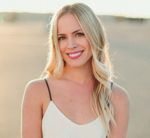
Amy Hood is the co-founder of Hoodzpah Design Co. and the designer of the latest font from RetroSupply, Palm Canyon Drive.
Over the past 4 years they've created a body of work that any designer would envy.
They don't have fancy $100,000 art degrees. They didn't spend years working as an intern under a design celebrity.
They just create bold, unapologetic branding and design.
In this interview you'll find some inspiring stories about building a design business. Plus, you'll learn step-by-step how Amy Hood created the best-selling script Palm Canyon Drive with zero experience.
Enjoy!
Thanks for taking the time to let us interview you! Let’s get right to the important stuff. What’s your favorite ice cream flavor and why?
Right to the hard hitting questions! It’d have to be Cotton Candy. The kind that leaves your mouth completely stained blue, like those old Kool-Aid mustaches we used to rock in middle school. Rite-Aid has a mean one that tastes as much like cotton candy as it does like food coloring.

Can you tell us a little bit about yourself and how you got started as a designer?
I started out as an artist, going to community college to study drawing, painting and sculpting.
I fast learned that I was not - and probably never would be - a great artist like the great Jacques Louis David or Edgar Degas. But I still wanted to do something creative that I could make a living at.
By happenstance a guy who had been coming into the coffee shop I worked at offered me a design internship at a magazine - and it was paid! He taught me everything on the job and I learned how to work fast and on tight deadlines.
I was learning so much that I just dropped out of college and did things the old apprenticeship way! And I’ve been loving design ever since. It’s such an applied art form.
Other than that, I live in Newport Beach, a block from the bay and a block from the beach, surrounded by water on all sides. I’m a Netflix junky, an amateur hiker, an enthusiast for all things classic and moto, a Monster Ballad blaster, and a curious cat always looking to meet new people in new cities.

You have an unmistakable style that pays tributes to your past but is also unique and original. What is one action based steps new designers can follow to start developing their own style?
I think you just have to try things! Try different styles. Find things or styles that you like from the great designers that have gone before you and try to make new pieces in their styles.
Learn how they made things. Make their style your own and keep doing that till you find the style that resonates best with you.
They say people change every 7 years. And I think sometimes that also applies to our design style and sensibilities. You can have a style and still grow and change and polish it along the way.

You recently created a retro inspired typeface called Palm Canyon Drive. Can you tell us what inspired it?
I’m a BIG fan of Palm Springs. I go there at least twice a year to rest, relax, gather my thoughts and get pumped and inspired to get back to work. There is so much to inspire there and most of it in fabulous midcentury modern form.
I always see all the old script and type left over from from the days when Hollywood’s stars would escape there to swap the lime light for sun light in the 40s and 50s. Sinatra, Bob Hope, Elvis. Those were the days when more was more. Opulent tiki bars and dance clubs were the place to be.
Sometimes I think I was born in the wrong era, so this font was a chance to pay homage to the retro California culture that I often look to for inspiration.

This was your first time creating a complete typeface. Can you tell us your process for approaching a new type of project (like creating a typeface) for the first time?
You know how sometimes you don’t know what you like or need but you know what you don’t like?
Well I knew all the gripes I had about fonts I’d purchased in the past, so I tried to approach this font with the idea of making it something I would want to buy.
Here's the step-by-step process I used to create Palm Canyon Drive:
Step 1: I created a mood board of a old match books and postcards and logo marks that I’d seen around Palm Springs and in Los Angeles and on Pinterest.
Step 2: I started sketching letterforms. On their own, formed together into words… a thousand different variations to just get ideas on paper. I didn’t spend as much time in the sketching phase on this as maybe some type designers do.
Step 3: I scanned all my letter sketches in and started picking my favorites and creating vector variations. I make guidelines to make sure all the heights are going to match up: cap line, midline, base line, ascender and descender lines, and so on. I also make my own slanted guides to make sure the slant on my script letters all match up. I always put those in fuchsia pink and lock them on their own layer so I don’t have to mess with them anymore.
Step 4: As much as I can I like to copy the letterforms I already have created and alter them to match the ones I’m about to make. I find it helps me keep things consistent. It also saves time!
Step 5: After making all the letterforms, I started doing the real hard work: testing them by putting them together to form words and phrases and see how they work together. I pretty much changed every letter in some way or another after that step.
Step 6: I was designing a script font so making all the connecting upstrokes match on every letter was the hardest part for me. And making sure the kerning looked good and even.
Step 7: I sent it off to Dustin to actually make it a .ttf! Then more testing, more testing, more tweaking and testing until we got it right. Spacing is so much of it!
Step 8: We didn’t skimp! We included alternated letters and Drop Caps and numbers and glyphs: All the stuff people half ass in display fonts. We did them and we did them right!

What fonts do you think pair best with Palm Canyon Drive? Any personal favorites?
I’ve been using a lot of retro sans serifs like Neutra and DIN Condensed and Bebas Neue and Futura.
Thanks for sharing a little about yourself and your work, Amy!
Thanks, Dustin!
About Amy Hood
Amy Hood is the co-founder of Hoodzpah Design Co. based in Orange Country, California. Their clients include Google, The History Channel and Hot Wheels. Amy is also the designer of the best-selling typeface Palm Canyon Drive available exclusively from RetroSupply.