Comic History: Linework and Print

Comic History: Linework and Print

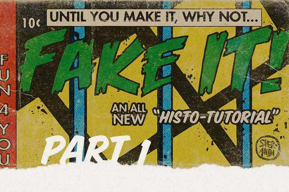
Learn the secrets of simulating vintage artwork in this three-part series. These articles are a must-read for digital artists, illustrators, comic book creators, and print designers looking to bring retro touches to their work.

In part one of this series, we’ll discuss the early history of print and the importance of understanding line work.

Once you've read Part One, be sure you don't miss Part Two and Part Three of the series. We'll cover color and printing methods as well as how to add authentic texture to your work.

How Vintage Comics Were Made

Nostalgia is a powerful force. It’s more than a little ironic to employ a nearly all-powerful 21st century digital imaging tool such as Photoshop to recreate flawed or damaged old media.

Ignoring our motivation for doing so, for the moment, the technical “how to” will benefit from a familiarity with the old tools and processes. If we understand how vintage comics were made, then we’ll have a simple time recreating them.

Side-by-side comparisons are helpful. Here, the rooster is new and the mouse is vintage.

Close ups of two comic panels. One of a chicken and one of a mouse.

Here's what we're going to cover in this three-part series

This post, the first of three, is here to help the novice artist or even one with some experience to create images that accurately simulate printed vintage comics using Photoshop and the tools provided by RetroSupply.

All-in-one comic creation

Capture the look of vintage comic book printing with ColorLab. Get fine-tuned control of color layers, ink textures, line work, and more.

Capture the look of vintage comic book printing with ColorLab. Get fine-tuned control of color layers, ink textures, line work, and more. Available for Photoshop, Illustrator, Procreate, and Affinity.

This post touches on how line is tied to the history of printing, and how to approach drawing that key image for which comic book artists are famous.

The second entry in this series will be about the history of color in print and the third entry will be a discussion of paper and texture. Understanding the interaction of line, color and texture is essential for that vintage effect.

The Early History of Print

Printing first appeared in China roughly 1,600 years ago. Texts and images were carved into wooden blocks, then these blocks were covered with ink and pressed onto rolls of silk. This continued for centuries until paper was developed, again in China about 200 years later (give or take), and paper books took the places of silk scrolls.

Looking at these early examples of print, what is evident is the bold line, unavoidable because the images are carved out of wood. For a line to exist, and for it to persevere during printing, it has to have a certain heft.

A stone tablet with  writing etched into it.

Paper revolutionized printing and it spread around the world. The concept of printing found its way to the West as spoils of war.

Some of the earliest printed objects were playing cards. Ephemeral in nature, few early playing cards still exist. We know of them, however, because of the bans placed on card gambling in ever widening circles throughout medieval Europe.

At this point, prints were typically one color, the KEY image, with additional colors added after the fact, either stenciled or hand painted, similar to a coloring book. This single-color key image was carved or engraved out of wood (and later, metal), therefore all images consisted only of lines, solids or voids.

In the West, the inks were oil-based and printed using technology related to the wine press. It was hundreds of years before multi-color prints become common in the West whereas Japanese artists excelled at rich and inventive multi-color printing, at a tremendous volume, using water-based inks and printing by hand.

A page from an antique book depicting people in rectangular boxes.

The History of Comic Book Printing

There is a lot of time and technology to cover – enough to fill books. If we hope to get through this, I’m going to jump right now to the period that directly reflect our interest in comic books.

I’ll go back and cover some of this ground in the subsequent essays. Ready?!

In 20th century, if we dissect a typical offset printed comic book page, we can think of the artwork consisting of two parts: the key image, printed in black and the color plates blue, yellow and red – or Cyan, Yellow and Magenta, three colors that, when printed in screened layers, with Black (or K) as the final plate, creates a wide range of color.

By this point, the key image, the black and white drawing that artists turned out at a high rate, and in fact, all the printing plates, were poured molten lead. When cooled, these plates were fitted into huge, industrial presses and printed at high speed. In order to recreate that 1950s comics look in your work, it’s helpful to understand the printing technology from that time.

A metal printing plate next to a page of a comic book with the same design.

In mimicking vintage comics, start with the key image. The key image in a comic must be quite bold, and it must be done in black on white, with no gradation, or grey tones – at least to start with.

Hatching and cross-hatching are acceptable and sometimes necessary, but think stark black and white, with bold lines that can be captured and preserved in metal.

A comic panel drawn with ink on paper.

In the last 70 years, printing has continued to evolve and improve – case in point are the inkjet and laser printers that many people have in their homes.

The digital print produced quickly and silently would be unimaginable to the poor pressmen who endured the heat and deafening roar of the presses, on occasion losing digits, limbs or even their lives to those industrial beasts.

An illustration of a newspaper printing press.

How to Make Retro-Inspired Comic Effects

Step 1. Begin with the End in Mind

I teach comics history and comics creation at a major university. The first thing I advise my students, and indeed, the first thing I think of when I’m making comics, is the destination.

Is this work going to be printed or is it for a screen?

If printed, what are the print specifications, such as finished size, number of colors, bleed, if any?

If the drawing is headed for screens or devices, is there a maximum allowed file size for the piece?

How does it need to be optimized for the screen?

Only once you have those parameters, the X, Y and Z of it all, you can set up your Photoshop file and begin. In comics, the beginning is always the key image, the black and white line work.

The Image Size window in Adobe Photoshop showing the document is set to 8.5

Step 2. Draw Rough Thumbnails

I start a drawing with rough thumbnails that I make on scratch paper or in one of dozens of asynchronous notebooks that I have lying around. That’s where I’ll work out the how and why of what I’m making.

I make a lot of thumbnails – I don’t spend a lot of time on them, nor do I get too attached at this point. When I’m finished, the winning doodle becomes a loose blueprint for the artwork.

By the time I’m drawing and then coloring, I’m just executing the already established plan, such is the usefulness of thumbnails.

A drawing made in ink on paper of Uncle Sam holding a sign that reads

Step 3. Start Inking

Next, depending on where I am, I’ll either pick up a brush, if I’m in my home studio, or my MacBook Pro, iPad Pro and Apple Pencil if I’m on the road.

For a long time, I despaired of digital drawing until I stumbled across RetroSupply. With RS, I found digital brushes that perfectly simulate my own cramped, crabbed brushwork.

Before, traveling to work in a studio in Germany or Hong Kong or wherever I was headed, meant carefully packing up my tools and materials. I do love my brushes, pens and papers, but the ease of use of the digital tools is liberating. I can throw my Apple products in my carry-on bag and work anywhere.

Steal these brushes

Grab this free collection of professional brushes to use in your artwork including inking pen, pencil, charcoal, halftones, distressed textures, and more! Available for Photoshop, Procreate, and Affinity.

Grab this free collection of professional brushes to use in your artwork including inking pen, pencil, charcoal, halftones, distressed textures, and more! Available for Photoshop, Procreate, and Affinity.

An Apple iPad Pro and Pencil is an expensive option, but long before those existed, I used a simple, pressure sensitive pen input device for years. They take a little getting used to, but with some practice, they work just fine. One of these is what I would advise anyone on a budget to use.

For $50, you get a tool that lets you really capitalize on all the great qualities that Photoshop has. You simply can’t get that delicious comic book line without pressure sensitive input. All tools have learning curves and the only solution is practice.

A section of a vintage cartooning book.

The Importance of Line Drawing in Comics

Again, the first step in creating authentic, vintage-inspired artworks is the line drawing. Often overlooked in drawing instruction, line quality is the most crucial ingredient in an engaging drawing. A calligraphic, push-pull, thick-to-thin-to-thick line is ignored only at the artist’s peril.

There’s a secret to getting that smooth, flowing, bouncy line in Photoshop. Brushes have a lot of parameters you can fiddle with but the control called “Smoothing” is the secret sauce.

Kick smoothing up to 100, and you get a, well, smooth line. It requires a little practice, as it feels like driving an 18-wheeler across a frozen lake, but oh, does it glide!

A black and white drawing of two eyes and two hands surrounded by a black background.

Final Thoughts on Line Work in Comics

In vintage comics, these bouncy lines would have been made using dip pens with flimsy metal nibs that had been sanded and flexed, their physical condition hovering somewhere between just broken-in and broken.

Artists hoard the pen nibs they like, worried that the production on these pen tips might halt, leaving them without the tools they need. It’s happened before!

With RetroSupply, that fear is gone. You can make your digital lines with impunity. Your digital nibs won’t crack or snap, and your bottomless inkwell won’t ever spill.

A black and white drawing of two pigs with one handing money to the other saying

Work on your lines, fiddle with smoothing and next up will be a brief discussion of color. Finally, we’ll round out this series with a discussion on paper and texture.

More Articles on Simulating Vintage Artwork

Now that we've covered linework and a bit of the history of printing be sure to check out these articles on color and print as well as texture and print.


ABOUT THE ARTIST

Christopher Sperandio is an artist, writer and university professor. In 2015, he founded the Comic Art Teaching and Study Workshop at Rice University, where he teaches art and comics. Pinko Joe, Sperandio’s first graphic novel, was published by Argle Bargle Books in 2020 and called “laugh out loud hilarious” by Broken Pencil Magazine.

Volume two of this series is available via arglebarglebooks.com. Follow Sperandio on Instagram, Twitter, or visit his website.