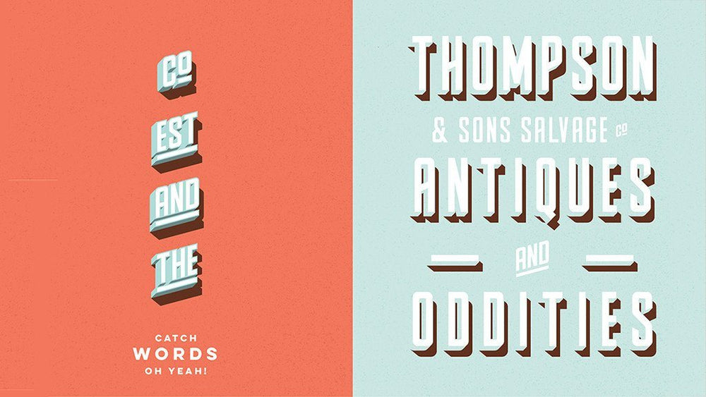
Parts & Labor is a fantastically flexible four-layered font with almost infinite variations. Created by talented Ontario-based designer Joe Andrus, you can use the stunning retro display font on its own; or stack the three supporting 3D, shade and shadow weights in any combination to add depth and interest.
The sheer flexibility isn’t just addictive, it’ll kick-start your creativity – and save you time while you’re designing, too. It’s also a steal at $29 (or $19 if you buy it before 29th January).
“Parts & Labor is hardworking,” explains Joe, who runs his own design studio while dabbling in illustration and screenprinting on the side. “I created it specifically for headlines, titles, posters and branding projects, but it works especially well in any creative scenario where the typography is part of the focus of the design."
Buy Parts & Labor now!
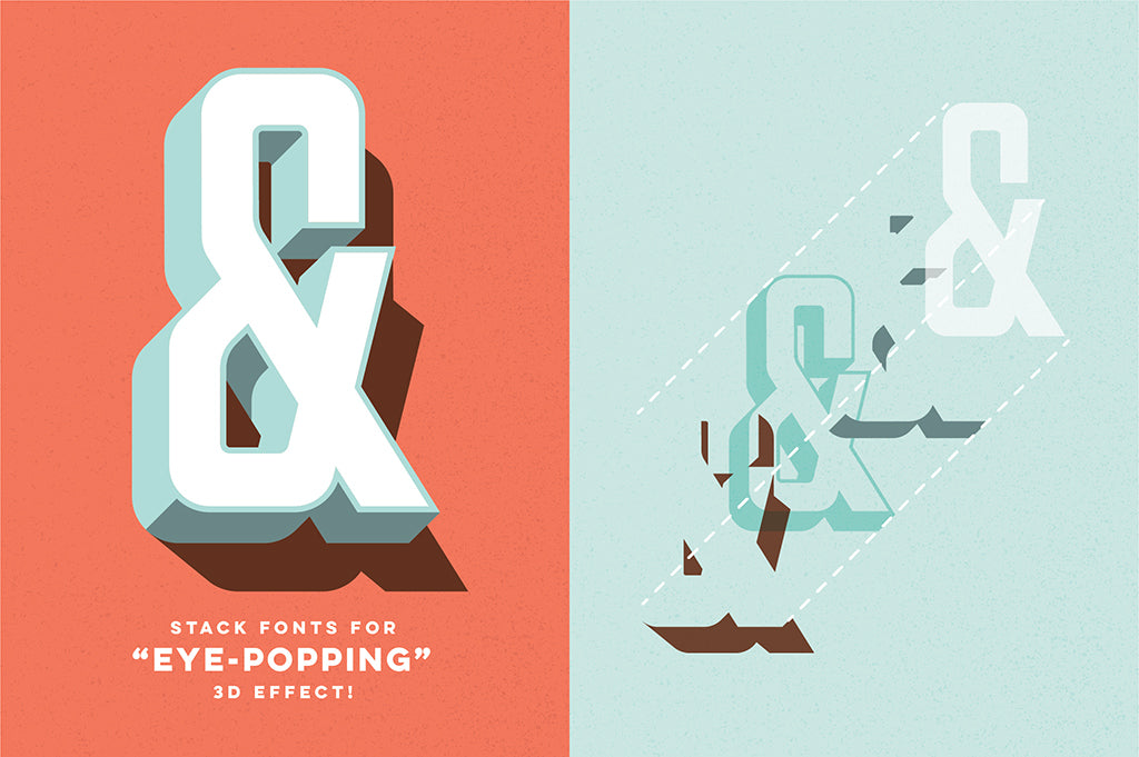
Here’s how it works. Parts & Labor is a modular typeface: stack the different weights in perfect combination and they produce a retro 3D, extruded effect. Want to change the combination, or color of individual weights? You can. Want to use a weight solo? You can. There are hundreds of variations, with each option quickly producing a unique vintage aesthetic – and saving you time.
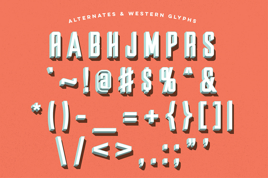
“I didn’t want designers to feel handcuffed to the 3D system, so the basic weight has been designed for use on its own,” says Joe. “For even more flexibility, I’ve also included a set of stylistic alternate characters for specific glyphs, which give a nod to the mid-20th century sign painter.”
“These can be swapped in and out with the standard set, and work really great for titles – or for that client branding project that needs a little more personality. The fun is in playing with all the different options and getting results quickly.”
Better branding
For as long as Joe can remember, he’s been fascinated by the bold headlines, condensed display typefaces and powerful messaging seen in mid-20th century newspapers and propaganda posters. “I wanted to create a variant on the style that was just as hardworking for use in bold headlines and signage, yet distinct enough for modern-retro branding work as well,” he explains.
He says Parts & Labor can be used in many forms of design, but is best-suited for more creative works, such as screenprinted posters, art prints, editorial features, advertising headlines, logos and type-based assignments where the messaging is the focal point of the creative.
To create it, Joe designed all the base characters in Adobe Illustrator. Once he was happy with the full set of base glyphs, he experimented with the 3D and shade effects until he found a result he was happy with – and could also reproduce consistently.
“After the effect was applied to the full font set, I imported the vector letterforms individually into my font creation software of choice, which is Glyphs App,” he recalls. “It’s a great piece of software and has built in tools for exporting layered font systems.”
3 pro tips for getting more from Parts & Labor
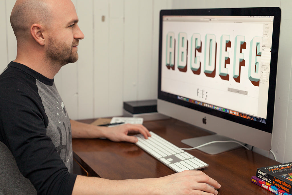
Image: Joe Andrus designing Parts & Labor
Parts & Labor is particularly useful because of its versatility. The ability to quickly and easily adjust the look and feel of a font simply by experimenting with layer or color combinations can save hours in the creative process – so you can make sure the rest of your design is perfect.
However, there are other ways to make Parts & Labor work harder for you, as Joe explains.
01. Pair it with a script
“Try pairing the fonts with a retro-modern script,” he advises. “Scripts tend to contrast nicely with the bold and condensed figures.”
02. Pair the full and flat versions
“You could also pair the full four-weight 3D font together with the main flat display weight,” he continues. “This seems to give a visual nice contrast, and it takes the guess work out of pairing fonts.”
03. Use a wave path
“Try running the text on a slightly curved or waved path. Don’t go too crazy, but having the text running on a slight curve or waved path helps to solidify the retro vibe. In conjunction with the 3D set, you’ll be getting into that sign-painted look and feel.”
How to get started
It’s super easy to integrate Parts & Labor into your workflow. The font is available in OTF and TTF formats, and should work with all font management software. “I currently use Extensis Suitcase Fusion,” says Joe.
“Once installed, to achieve the layered 3D effect the fonts must be copied and pasted on top of each other exactly. My best advice is to use the Paste In Place command, or an equivalent. Then select your text and manually change the weight within the Parts & Labor font set.”
Joe created Parts & Labor to fill a gap in his own type library, and intends to use it as much as he can – starting with new personal branding. He boasts a varied roster of clients, ranging from large Canadian companies to boutique brands, and hopes to make illustration a larger part of his business this year. “A highlight for the studio was working with Patagonia Outdoor Clothing,” he reflects. “It’s such a great globally conscious company that you can really get behind.”
He continues: “I’m really excited about Parts & Labor. You can achieve so many different looks by simply experimenting with different color and layering combinations. The characters have a timeless, throwback feel. It’s a classic take with a modern spin, and it just works.”
Check out more of Joe’s stunning design and illustration work below, and on his studio website.
Get the Parts & Labor font family now!
We’re offering Joe’s Parts & Labor layered type system, plus a bonus free Parts and Labor Illustrator action that will make any font 3D in seven seconds or less (worth $17) – for just $29.00. Don’t miss out! Grab it now!
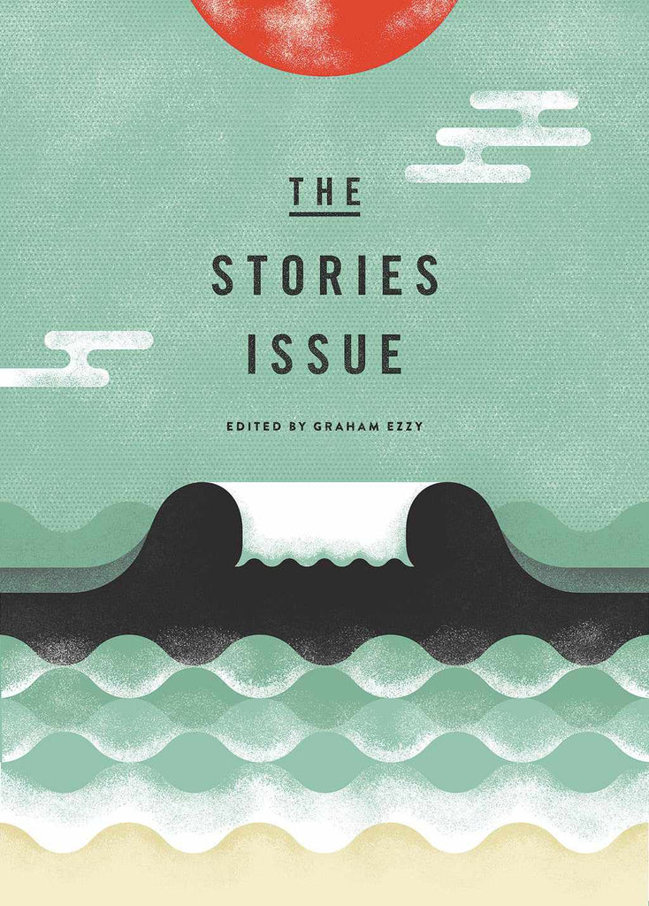
Image: Joe Andrus Design
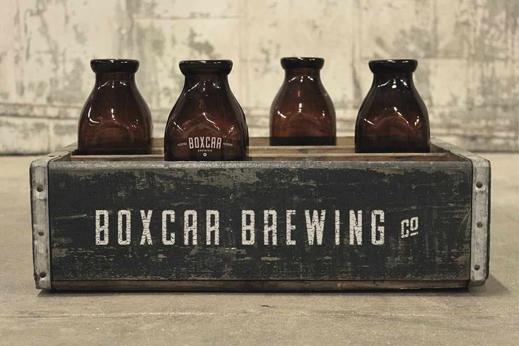 Image: Joe Andrus Design
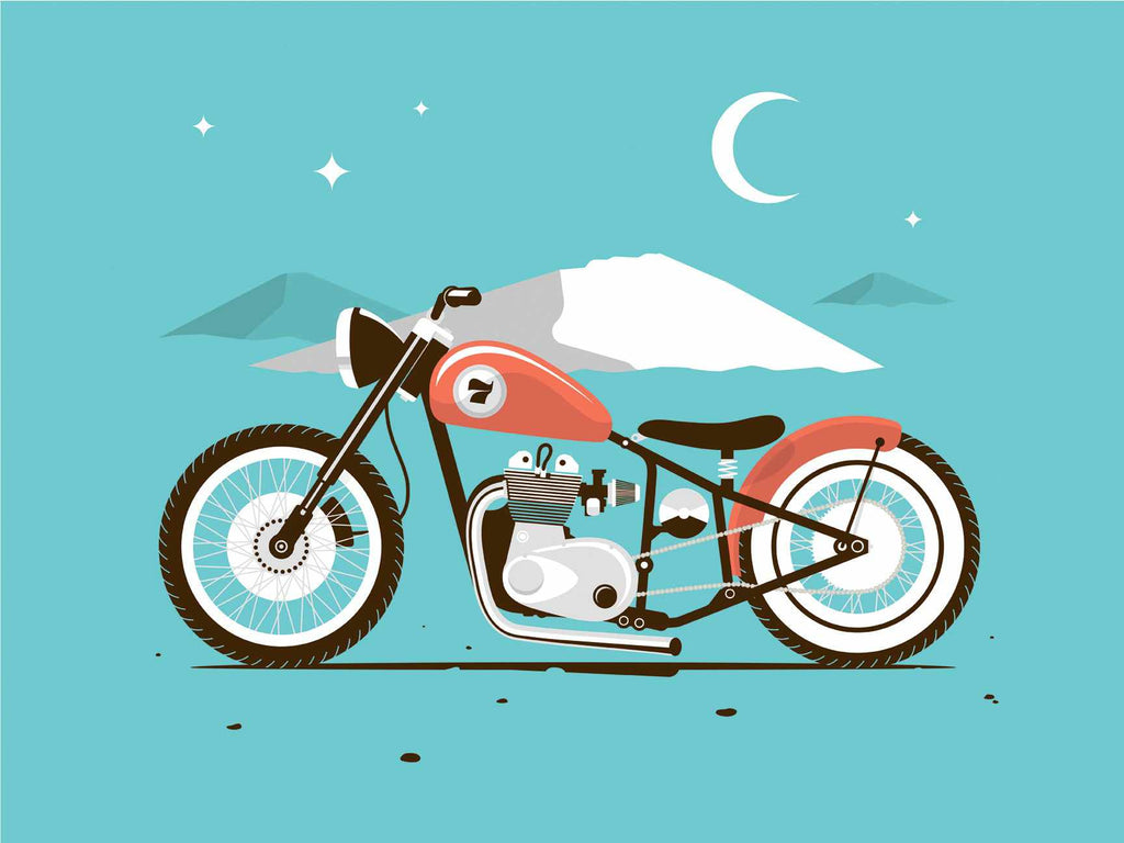 Image: Joe Andrus Design
 Image: Joe Andrus Design
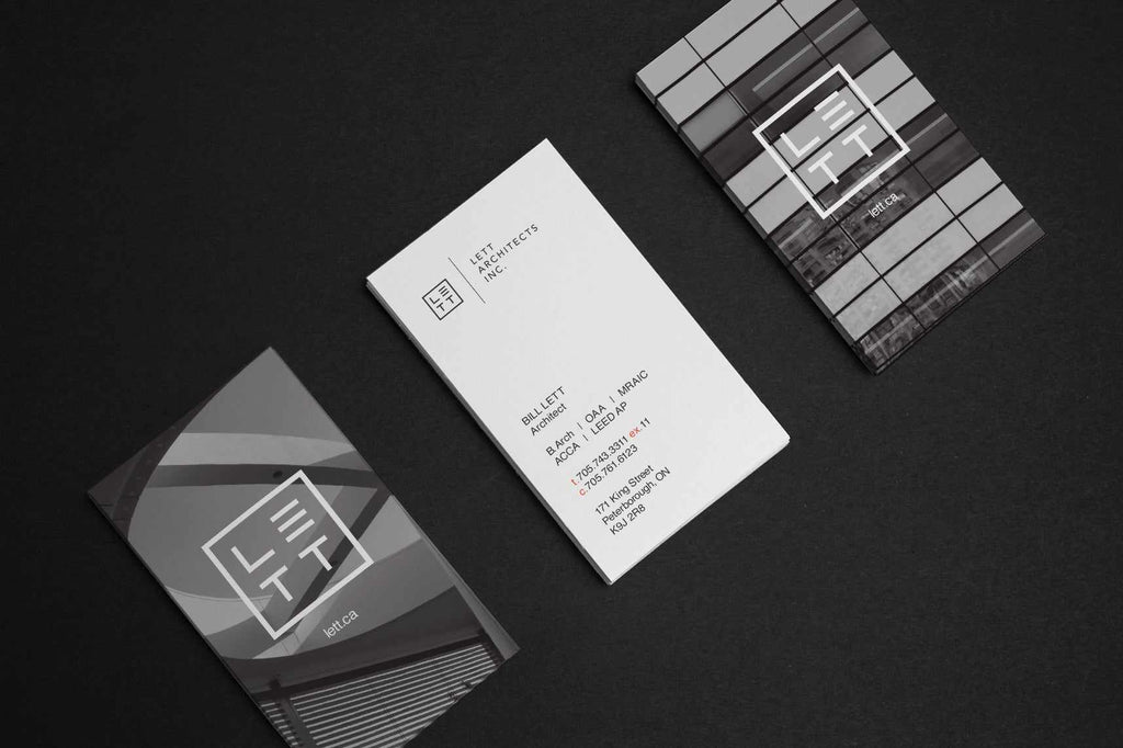
Image: Joe Andrus Design

