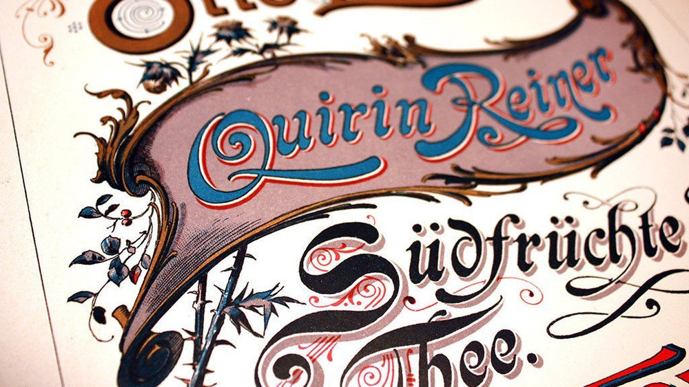
Back in April 2014, lettering artist and graphic designer Jason Carne had an idea. The Pennsylvania-based freelancer was in Columbus, Georgia preparing to deliver a talk on the importance of preserving historical design elements as a means of self-study, when it struck him: why not hunt these scarce reference books down, and start sharing the wealth?
“I’d partnered with Keith Tatum, aka The Type Hunter, to deliver the talk,” recalls Jason, who’s worked with Disney, Warner Bros, Foo Fighters, Wu-Tang Clan and more over his decade-long career.
“Keith collects – and often re-creates – a lot of vintage ephemera and labels, but I was more drawn to the books that taught you how to make the lettering and ornaments that make that ephemera so attractive. I was fascinated with Victorian-era alphabets, monograms and decoration, and I realized that there was a real shortage of readily available information on them on the internet."
Save 72% Off the Lettering Library Mega Bundle Today
The Lettering Library was born. In August 2014 the website launched with 50 rare, vintage hand-lettering books dating pre-1930, to a fanbase of over 1,000 eagerly waiting lettering aficionados.
Fast-forward almost three years, and Jason’s stunning $12,000 collection now sits closer to 300 titles and boasts a global audience. More importantly, his books have helped countless creatives – including Jason – become better lettering artists, and take their personal and commercial work to the next level.
We took five with Jason to find out more about his fascination with hand-lettering. Here, he explains the charm of custom lettering, and how the Lettering Library Mega Bundle might just win you more work…
Bonus: Download a FREE lettering book from the pack. Just this one book in the pack includes resources like working with pencils, brushes, speedballs, letter spacing, stylized lettering, calligraphy, and more!
How has the Lettering Library made you a better lettering artist?
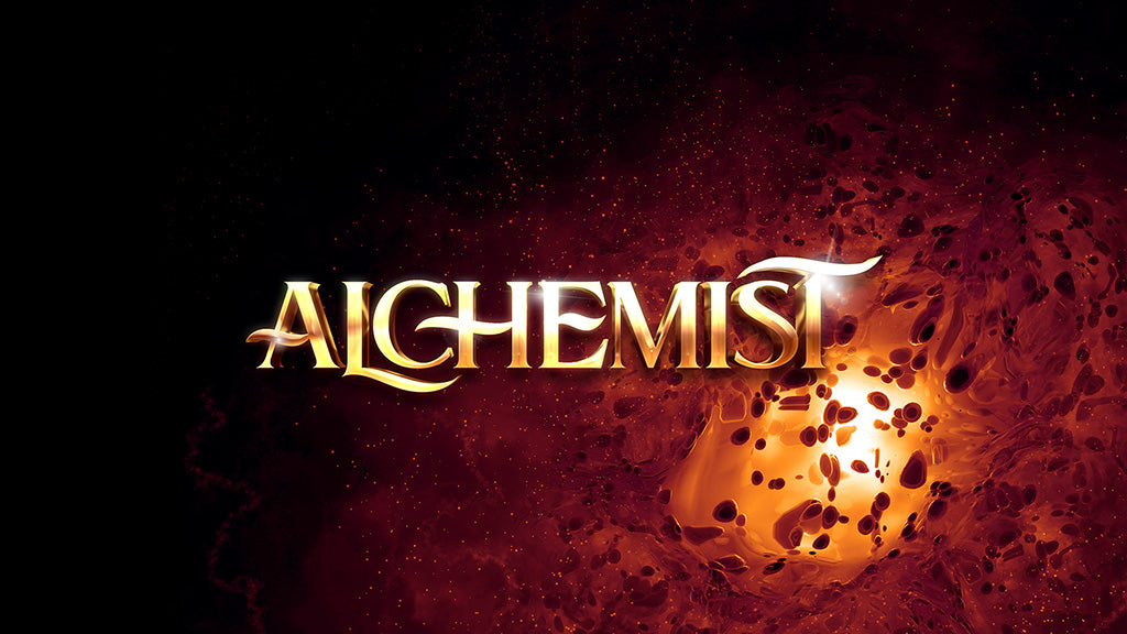
Image: Alchemist display typeface, by Jason Carne
Jason Carne: One of the largest points of improvement I’ve noticed in my own work is my understanding of lettering proportion. Sure, a lot of what’s in this collection satisfies the thirst we all have for eye-candy and beautiful pieces of inspirational lettering and design, but there are also books that deal either in part or completely in instruction.
Last year, for instance, I hit a roadblock while creating a typeface called Alchemist. Something felt off about my letters, but I couldn’t put my finger on it. When I eventually discovered that the proportions of the letters were throwing everything off, I turned to a book called Constructive Lettering published in 1929 that deals specifically with this subject.
Within a few hours my typeface was looking worlds better, simply by adhering to the instruction contained within the book’s pages. That’s just one example, but these books have helped me more times than I can count. Whether it be coming up within concepts for monograms with uncommon letter combinations, or finding a new or interesting fill pattern for decorative lettering, these books are always there to solve a dilemma I’m having.
What’s included in the Lettering Library Mega Bundle?
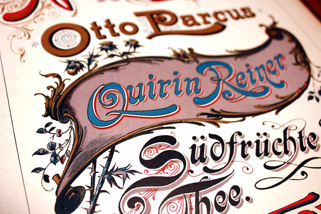
Image: Lettering Library Mega Bundle
JC: Every book I have ever photographed for Lettering Library is included within this bundle. There was absolutely zero trimming or curation on my part – I wanted to make sure no one missed a thing. And each book is the full book. There are none that are partial or incomplete, save for an occasional page torn out by the original owner.
The subjects these publications cover include – but aren’t limited to – sign painting, alphabets, penmanship, calligraphy, monograms, show cards, borders, ornaments, scrolls, decorative elements, flourishing, layout design, letter construction, letter proportion, spacing, engraving, gilding, and much more.
This bundle provides vital and insightful information on an extremely wide and well-rounded set of subjects from some of the greatest craftsmen of the 1830s to the 1930s.
Who will benefit most?
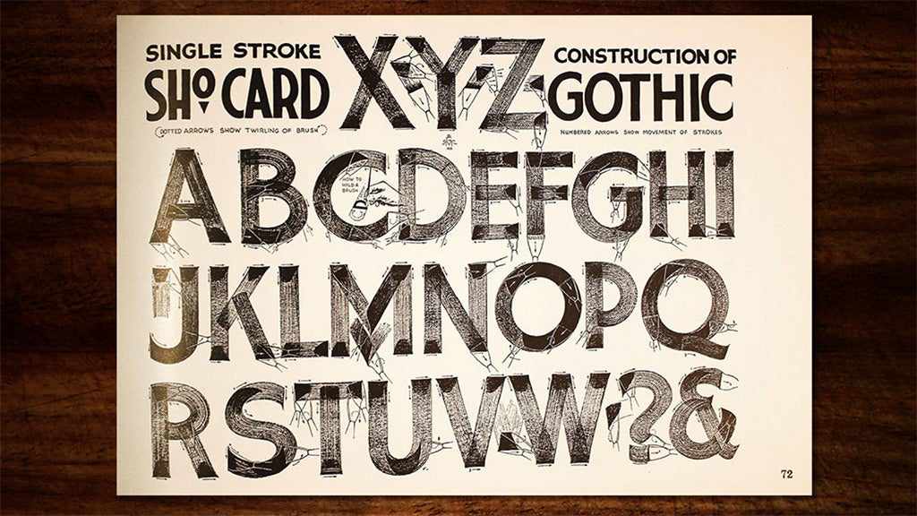
Image: Lettering Library Mega Bundle
JC: Whether you aspire to be – or already are – a logo designer, a gig-poster artist, a type designer or otherwise, these books will give you the educational foundation that you need to be successful in your field.
Lettering is one of, if not the most critical means of communication in society. A letter’s form, style and execution can convey a wide array of emotions and meanings, so learning how to construct them properly and style them appropriately to depict your message effectively is vital in your field.
Even if you’re already an adroit professional and rather experienced in your area of expertise, there is a nearly endless wellspring of inspiration within the pages of these books, opening your mind to a vast cache of possibilities and aesthetics you may have never considered before. If you find these books useful for even a single commissioned project, they have already paid for themselves.
There are 117 books in the bundle – where’s the best place to start?
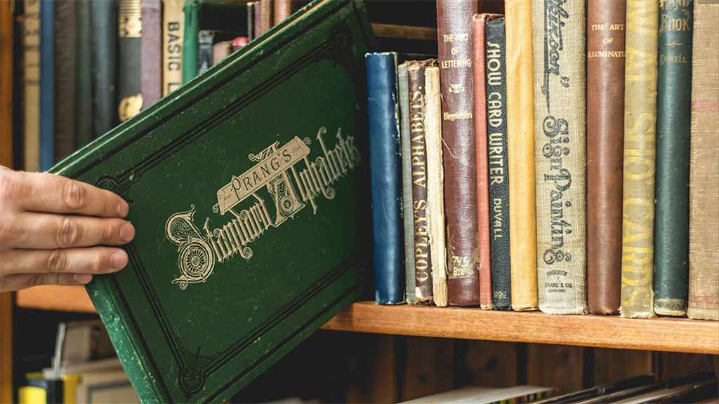
Image: Jason has built an incredible library of rare hand-lettering resources
JC: I wouldn’t say there’s a definitive starting point within the bundle. The collection is what the user makes it, or requires of it. Oftentimes those purchasing this pack are already bonafide experts in their field, whether they’re professional calligraphers, master sign painters, or extraordinary lettering artists – all of whom need very little in the way of instruction, but might like to see some inspirational and beautiful works within their fields of interests.
Another major portion of my audience are beginner and intermediate-level artisans looking to better their skills with an education they simply cannot get elsewhere. Education centers offering any curriculum on lettering, penmanship, calligraphy, sign painting, or the related arts are extremely scarce, if non-existent. Lettering Library is the bridge to the past that lets the students of today learn from the masters of yesteryear.
What advice would you give for getting more from the resource?
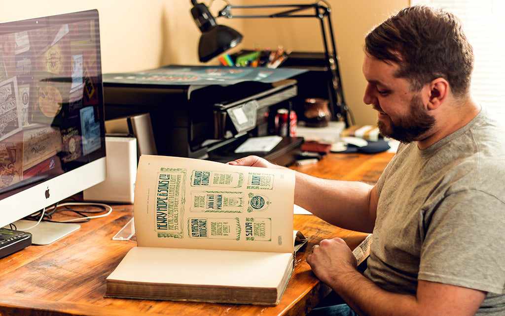
Image: Jason referring to one of his many vintage hand-lettering books
01. Keep an open mind
JC: My main point of advice would be to not take the word of just a single book in this collection as gospel. Many will, at times, have slightly conflicting schools of thought and it’s important to curate an education for yourself. For example, some books will have beautiful alphabets, but poor instruction on letter spacing; others will have the opposite. Pluck the best nuggets of knowledge for yourself along the way, instead of defaulting to one book.
02. It’s ok to trace
JC: Another big tip would be that tracing is alright: it’s not a sin, as many would have you believe. Trace your alphabets, learn the proper mechanics of pen or brush strokes, learn what the proportions of letters should look like, and how and where to apply contrast to your strokes.
You’ll be amazed at how fast you learn by copying the work of past greats. I wouldn’t ever suggest that you pass off copied work as your own in real-world commissioned pieces, but as a learning tool the importance of tracing can’t be overstated.
In your own portfolio, what’s your favorite hand-lettering project?
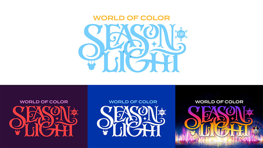
Image: Jason Carne – Disney, World of Color
During the summer of 2016 I was commissioned by Nomadic to create a custom logotype for Walt Disney’s World of Color – Season of Light event in Disneyland, California. The end result wasn’t a ‘hand-lettered’ piece by definition, but it began as one and was still a completely custom piece of lettering.
Walt Disney has never struck me as a company that would settle for ‘stock’, so I knew going into this job that the letters needed to be custom, playful, and able to flow and emit the magical and whimsical essence that embodies all of their projects. This is one of those times where everything fell into place just right.
Why do you love hand-lettering so much?
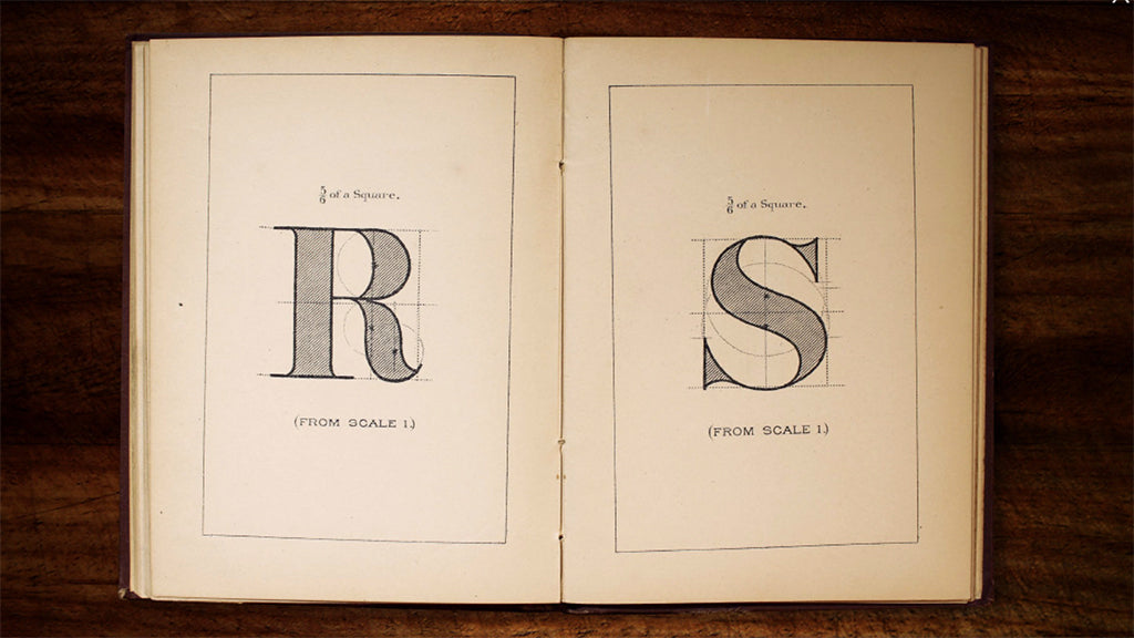
Image: Lettering Library Mega Bundle
JC: I’ve always said that custom is king, and hand-lettering scratches that itch that creatives have to do something that’s never been done before. Hand-lettering might not always be wholly unique in every sense, and it may even be derivative to an extent sometimes, but it’s always graced with the imperfections and mechanics of the human hand and eye.
Even if you ink a line with a ruler, that tiny bit of bleed you get in the paper or slight jitter down the line removes the cold, mechanical precision of computer-based design. As someone who’s also a type designer, I understand the need and desire for visual perfection and harmony, but the charm and the allure of a custom hand-lettered piece from a really talented individual just can’t be beat.
You can see more of Jason’s stunning hand-lettering work on his website.
Save 81% on the Lettering Library Mega Bundle now!
We’re offering the Lettering Library Mega Bundle – 117 rare, vintage books on hand-lettering from Jason Carne’s personal library – at a heavily discounted price until midnight on January 24th. Don’t miss out!

