Botanical prints were essential for plant identification in the 18th century.
The prints would feature different species of plants, bugs, and insects.
Originally used for academic purposes today vintage botanical prints are beautiful pieces of history used to decorate homes and offices.
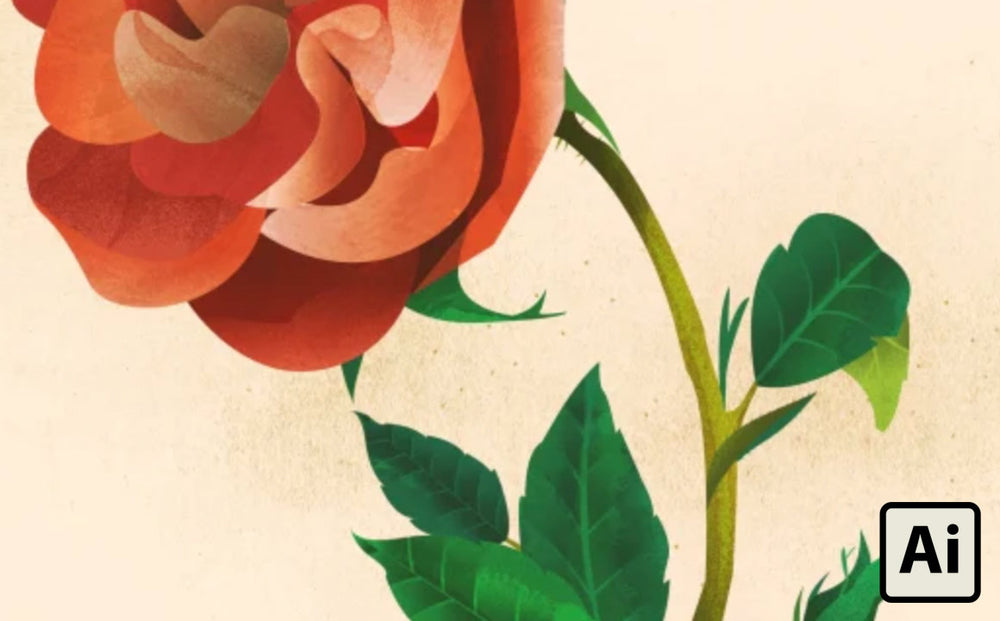
In this tutorial, I'm going to show you how to make a vintage botanical illustration in Illustrator with a little help from Photoshop.
For the illustration, I used Inkwash | Vector Ink and Water Brushes and Standard Issue Brush Kit.
I recommend adding these brush packs to your illustration toolbox, but you can always use Google for free brushes. If you go this route, beware of the quality.
Love Illustrator tutorials? Here are some others we think you'll love:
How to Make a Mid-Century House Illustration in Adobe Illustrator
How to Create an Engraved Illustration Effect in Adobe Illustrator
How to Create a 1960s Children's Book Illustration in Adobe Illustrator
Visual Research

I found these prints on Pinterest and Google. From them, I can see that the drawings use some textures and airbrush effects for lights and shadows.
I take what I found from my visual research and set them alongside my Illustrator artboard as a reference.
Sketch

I started the sketch directly in Illustrator. With the Brush Tool (B), I drew out the shapes of the bloom, stem, leaves, and bud.
I provided a step-by-step on how you can sketch the same the rose bloom. The sketch can be loose and doesn’t have to be precise.
Tracing and Filling in the Shapes

After you've completed your sketch, take the Pen Tool (P) and trace your sketch to create a shape for each element of the plant.

Next with the Pen Tool (P), trace out shapes for each petal and fold. After creating the shapes, they should be filled in with their designated colors.
I have a little color range at the side of the rose so I can easily reference what color to use.
Adding Shadows to the Petals

Since the visual references have airbrush-like shadows and lights, I decided to use gradients for my shadows.
Take one of the petals and then Copy it (CMD + C) and Paste it (CMD + F). With the pasted shape selected, add a gradient to it with the Gradient Tool (G).
After the gradient is applied, set to an Overlay effect to the gradient in the Transparency Panel (Window> Transparency). I do this process to all the petals.
Adding Textures to the Petals

Inkwash | Vector Ink and Water Brushes is the perfect brush pack for this type of illustration. I used it to add brush texture to the illustration so that it doesn't look too polished.
With the Brush Tool (B) selected, use vector brush Watercolor 19 (WC19) and draw a line. Then, curve the line to match the curves of the petals.
Next, copy the petal and then paste it on top. With the top petal and the vector brush lines selected, Make a Clipping Mask by right clicking and then selecting Make Clipping Mask.

I also used the vector brush pack to add more shadows for the petals.
To get into the clipping mask that has already been created, right click on the shape and select Isolate Selected Clipping Mask. Once you are inside, it should look something like the right side of the example above.
While inside the clipping mask, use vector brush Watercolor 25 (WC 25) and draw lines with the Brush Tool (B) where you want the shadows to be.
Repeat this process for all the other petals that need more shadow/ depth.
Making the Shadows for the Leaves

I also gave each leaf a gradient shadow and stem.
After their gradient shadow has been applied, I started to make the veins for the leaves. To make the veins, select the gradient shadow.
Then, using the Rectangle Tool (M), make a long rectangle in the middle of the leaf. With the line and the gradient leaf selected, use the Shape Builder Tool (Shift + M) and then click on each side of the leaf.
By doing this, a shape will be created separating each side.

Do the same steps for each vein. Repeat the process for all the leaves in the illustration.
NOTE: You may have to delete any other shapes that aren't needed.
Adding Textures to the Leaves and Stem

Adding textures to the leaves and stem gives them more depth. With the Brush Tool (B) selected, use vector brush Watercolor 19 (WC19) and draw a line. Curve the line to match the curves of the leaves and stem.
Copy the leaf/stem and then paste it on top. With the top shape and the vector brush lines selected, Make a Clipping Mask by right-clicking and selecting Make Clipping Mask.
Making Playful, Baby Leaves

Now we're going to work on shapes for the little details. The baby leaves were created with the Pen Tool (P). They can be made with two anchor points. Some were placed onto each other for more variety.
Making Thorns

The thorns are easy to create.
Use the Line Segment Tool (\) and make a short line. Change the Line Profile to match the example above.
I made a bunch of thorns and placed them on the stem of the bud and below the stem of the bloom.
Adding Grain Textures

If you look back at the references, you can see that some of them have a grainy texture.
Luckily, in Illustrator, there is an easy way to add grainy textures.
Select a petal, copy it and paste it and then add a gradient to it. Make sure the black part is where the shadow needs to be.
After that, go to Effect> Texture> Grain. A window like the one in the example above should open. Make sure your settings match the example and then press okay.

When the grainy textures are applied, change the transparency to Multiply and then change the opacity until you achieve your desired look.

Next, I wanted to add a grainy texture overlay to the whole illustration—this is where Photoshop comes into the mix.
The Standard Issue Brush Kit is a Photoshop brush pack that’s loaded with different types of subtle brushes that are perfect for adding an analog feel to your illustration.
In Photoshop, create a new file with the same dimensions as the illustration in Illustrator.
With a tan color and Brush Tool (B) selected, use Photoshop brush Pencil 4H from the pack.
Brush at different locations on the canvas until you achieve your desired look.
After that, drop it into Illustrator and change the transparency to Multiply. You can reduce the opacity to make the grains look less intense.
Adding Color Overlays

Lastly, some color overlays were given to the illustration.
Giving an illustration a color overlay puts everything under the same light and allows more depth to the illustration.
It will also help the illustration have the same aged paper color of our research images.
The first color overlay is made with a warm, medium gray to mute the colors of the illustration.
I made a rectangle that covered the whole artboard and then applied it with this color. I then changed the transparency to Screen and reduced the opacity.
The second overlay is made with a warm yellow-green to give the illustration an aged paper effect.
Like the first color overlay, I made a rectangle that covers the whole artboard and then applied it with warm yellow-green. I then changed the transparency to Overlay and reduced the opacity.
Final

Some vintage botanical prints have writings describing the species of plants, bugs or insect. With that in mind, I finished the illustration with text for the species of rose and the current year.
I hope this tutorial helps you create your own vintage botanical prints to hang in your house, office or building!
About Linh Le
Linh is a fourth-year graphic design student at the University of South Alabama in Mobile, Alabama. You can see more of her works on her website and Instagram.