Finding Your Style with Travis Price

Finding Your Style with Travis Price

Hey Travis, thanks for taking the time to share a bit about yourself and your work! Can you share a little of your background with us?

I'm a commercial illustrator based in Australia. I live in a rural town called Ballarat, 60 miles west of Melbourne. I'm nearly 40 and have a wife, three kids, and two dogs.

Most of my work is vector-based. I've been a freelance illustrator for the last ten years after transitioning from graphic design/advertising.

Honda motorcycle illustration showcasing Dragster display fonts designed by Travis Price.

Can you walk us through a day in the life of Travis Price?

The perfect day starts at 6 am with a 1-hour walk. I'm not a fitness freak but a walk a day helps me think so much more clearly.

After getting the kids sorted for school, I sit down to work at 9 am. I work from home but also have a desk in a friend's studio I work from two days a week. It's nice working from home, but I found I need to get out once a week just nice to talk to people.

I usually have a list of things I aim to get done that day. It helps to compartmentalize my workload. I finish at 6 pm.

This year my aim is not to work after hours…I got a bit burnt out last year. I'll still have a sketchbook while I sit on the couch at night to write down and explore ideas. But that's fun, not work!

What tools do you use most often in your work?

All my work is created in Adobe Illustrator, but it always starts as a rough sketch in my sketchbook.

Much of my work is concept-driven. I think it's important to have an idea before deciding what you're going to draw.

Because I usually work alone, I like to have movies or a TV series playing. I love documentaries.


Travis Price Font Collection


You've built a career doing the work most designers and illustrators dream of doing. What tips do you have for creatives to do more of the work they love?

When I was working as a designer in a studio, I just did the work and thought that's how you build your folio. I hit 30, and I didn't feel creative.

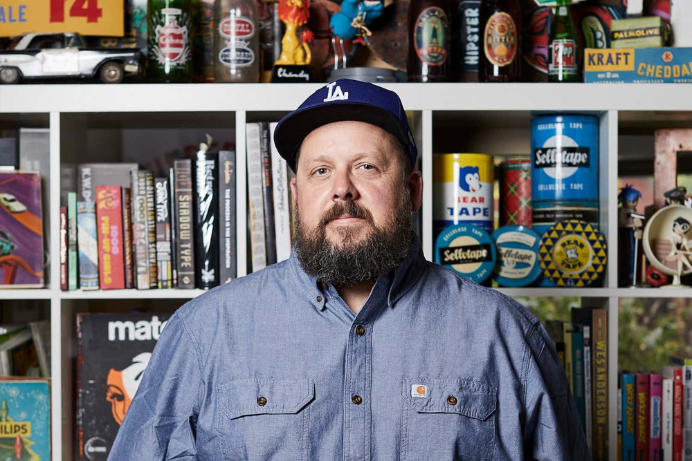
That's when I decided to become a freelance illustrator, and I soon discovered your folio doesn't need to be made up of "actual" jobs. I started doing little projects that I enjoyed.

One of the first was my Rushmore poster. I've always loved that movie. I did the poster, added it to my folio, and suddenly, I started getting projects referencing that design.

A recent example of this ethos is the Air Max day design I did for fun. A week later, I'm doing a large wall graphic for Nike.

Doing these self-initiated projects proves you can do the work, but I also found I have to do them to stay fresh and happy. It gives me a sense of evolving and getting better.

There's always room for improvement no matter what you do.

On an illustration like Hello Nasty? Can you walk us from start to finish through how you approach a specif illustration project?

It starts with sketches.

Once I've worked out the composition, I start looking at the styling. Will it be cartoony or a little more serious? I'm not known for a specific style, so it free's me up.

Once I've decided on things in my sketchbook, I'll then jump onto the computer and start drawing it up with the pen tool in illustrator. I still use a mouse, so anchor points are my best friends. I love using brushes for my strokes. I love the RetroSupply's brush sets for Illustrator.

These days I don't always want things to look perfect vector. I want them to be more tactile, so I'll overlay the texture I've made and scanned.

Last of all, I play with color palettes. Over time, I've realized the best color pallets don't need to be representative, e.g., Blue skin instead of Pink skin. I love using cream instead of white; it also allows you to use white as a highlight.

What's the #1 mistake you think that other illustrators and designers make that prevents them from doing original work in their voice? 

Over the last few years, I've noticed that guys are getting caught up in how detailed their illustration is and not putting enough prep into the composition or concept. A well-rendered illustration with bad composition is still a bad illustration.

Also, sometimes a smart concept is best conveyed with a simple aesthetic.

Cover design for CEREAL KILLA display font by Travis Price.

What actionable suggestions would you provide to help designers struggling to find their style and get back on track?

Do the exploration in your sketchbooks. I sketch the same thing over and over and then might sit on it for a day or two and come back to it with new clarity.

I think some creatives just think I'm going to draw a cool skeleton. Anyone can do that — give it a concept. What is the idea that's being conveyed?

Thanks for taking the time to share a bit about your work and ideas with us. Any final advice for illustrators and designers reading this interview?

Build your folio with the type of work you'd like to get. You don't get offered the dream job without the folio to back it up!

About the Artist

Melbourne-based graphic designer and illustrator Travis Price has worked with the world’s biggest apparel brands, including Nike, Santa Cruz, Converse, Mambo, Neff, Rebel8, Johnny Cupcakes and more.

He also has his own T-shirt brand, Jimmy Royale, and releases new ranges on a quarterly basis.

Visit his website www.travisprice.com.au and follow him on Instagram @travispriceillustration