How to Create a Retro T-Shirt Illustration

How to Create a Retro T-Shirt Illustration

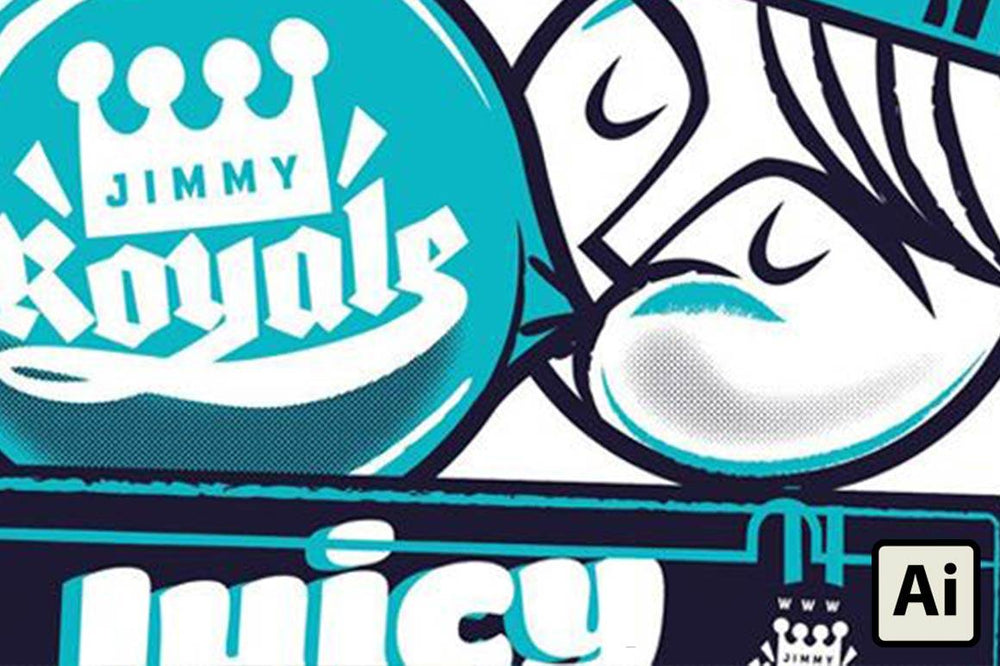
In this tutorial, I’ll walk through the process of creating a retro T-shirt illustration, from initial sketches all the way through to preparing the final artwork files for your local screenprinter.

On the way, we’ll look at how to step away from that perfect vector look by using Illustrator brushes to give your designs a nice retro vibe, and we’ll cover how to create custom halftone shading for your illustration.

As well as sharing some pro tips that I’ve picked up while creating apparel designs for Nike, Johnny Cupcakes, Rebel 8 and Converse, I’ll touch on some of the typical problems and pitfalls you need to watch out for. Luckily I’ve made the mistakes so you don’t have to!

To follow this tutorial, you’ll need a basic understanding of how to create vector shapes in Illustrator. We’ll be briefly jumping from Illustrator into Photoshop, and we’ll be using the VectorSketch Brush Set.

01. Collect reference material

Beginning phases of retro gum t-shirt design in Adobe Illustrator next to images of vintage bubble gum packs

All my projects start with research. I collected some references – in this case, old chewing gum packaging - and drew a very rough sketch, before creating the basic vector shapes in Adobe Illustrator.

Here, I quite liked the Black Jack color pallet, but decided to replace the black with a dark navy to help create a better synergy.

For screenprinted T-shirt designs, it’s good practice to keep the number of colors limited: for every color you use, a new silk screen needs to be created, which adds cost to the printing.

That being said, limited colors work best for memorable T-shirt graphics, in my opinion.

02. Lay out your composition

Laying out the composition for your retro t-shirt design in Adobe Illutrator

Once I’d created the basic shapes, I duplicated the individual packs of chewing gum and started to lay out my composition. I usually create the artwork at the exact size it’s going to be printed on a T-shirt.

When you’re designing yours, bear in mind that the artwork should be able to fit onto everything from a small T-shirt through to an extra large size, so that the same screens can be used when printing.

It’s also a good idea to speak to your screenprinter first about what document size they’d like the artwork to be set-up as.

03. Add highlights

Adding highlights to retro bubble gum themed t-shirt design in Adobe Illutrator

Next, I started adding highlights and shadows to the face and bubble.

When referencing retro illustration, you can see that it’s never perfect, so try to be loose when you’re using Illustrator. Imperfections add personality and will help your work stand out.

04. Select the right brush

RetroSupply vector charcoal and pencil brushes open and displayed in Adobe Illustrator

I love using different brushes in Illustrator. By default, the software has some nice brush libraries, but VectorSketch is awesome, so I opened the set in my document.

A quick way to do this is to select all, copy and paste the file into your art file, and then delete it. The brush styles will remain in your brush library.

GET THE BRUSHES

A collection of vector pencil and charcoal brushes, perfect for creating a hand-drawn look, made from real pencil and charcoal samples.

05. Customise your strokes

Zoom in of retro bubble gum themed t-shirt design showing customization of stroke ends using width tool in Adobe Illustrator

Having opened the RetroSupply brush set, I selected some of my highlight strokes and started adding brush effects to them. As you can see in the close-up inset image, some of the strokes are still quite square.

To get around this, go to Window > Stroke and select an appropriate profile from the drop-down menu. You can also customize the stroke profile using the Width tool, which is found in Illustrator’s main tool panel.

For most of my art, I use a mixture of both techniques. With this piece, I continued using different brushes and customizing the stroke widths throughout the composition until it had lost that perfect vector feel.

06. Add typography

Adding typography to bubble gum packaging in retro t-shirt design in Adobe Illustrator

Next, I added some typography and some detail to the chewing gum packaging. I’ve also added a bulge effect to the logo seen on the bubble, which you will find under Effects > Warp. I buy a lot of fonts.

You can buy amazing fonts for anything from $20 through to $200 - they’re a great way to add individuality to your work.

Too many people rely on the same free fonts that everyone else is using. If one of my fonts becomes 'on trend', I stop using it. It’s important to stay ahead of the curve.

07. Create a custom swatch for the shadows

Softening the edges of shadows in retro t-shirt design using Effect Stylize and Feather in Adobe Illustrator

The next steps are a little more advanced. First, I created a new swatch, go to Windows > Swatches, and select the New Swatch icon at the bottom.

I named it Shadow, set the color type to Spot Color, color mode to CMYK and created a custom color for my shadows (in this case, C: 87.03, M: 86.16, Y: 47.97 and K: 51%).

I then used this new swatch color to add shading to the illustration on a new layer and set the transparency (Window > Transparency) to an opacity of 20% so it wouldn’t be too dark.

Once I was happy, I then softened the edges using a feather effect (Effect > Stylize > Feather).

08. Output a PostScript file

Using File Print Output to create an Adobe PostScript File for a retro t-shirt design in Adobe Illustrator that will be screen printed

It gets a little complicated here.

I went to File > Print > Output and set the printer option to Adobe PostScript File. I changed the mode to Separations, but only selected my custom shadow color, and then hit Save.

If you don’t have the PostScript option in your print settings, you’ll need to add a PostScript Printer Driver - there are plenty of instructions for this on Google.

09. Create custom halftone shading in Photoshop

Opening Adobe PostScript file in Photoshop and only shadow areas appearing.

Next, I opened the PostScript file in Photoshop. As you can see, it only shows my shadow areas.

To create the custom halftone shading, I went to Image > Mode > Bitmap.

Please note that you can’t select Bitmap unless the file is already in Greyscale mode (if the image is in color, choose Image > Mode > Grayscale first).

I set the output to 300dpi and the method to Halftone Screen.

Then, in the Halftone Screen panel, I set the frequency to 25 lines/inch, which is a noticeable halftone dot (you can play with this number). Lastly, I saved the file as a PSD.

10. Open the halftone in Illustrator

Opening Adobe Photoshop file in Adobe Illustrator and creating Pantone colors.

Back in Illustrator, I deleted my shadow layer and placed the PSD over the top of the composition.

You’ll notice that the bounding box of my PSD file matches the size of my Illustrator document, so it’s easy to line up.

With it selected, I chose the Dark Navy Pantone color from my swatch library.

Remember to save this as a new file, so that you still have the working file with your shadow objects, should you need to make edits in the future.

11. Talk to your screenprinter

Zoom in of retro bubble gum t-shirt design in Adobe Illustrator showing halftone shadows

In my experience, screenprinters usually prefer to do the separations of the artwork themselves. Bear in mind that the dot frequency of the halftone can be an issue when it’s quite fine - for example 65 (compared to 25 on this project).

Again, the best thing to do is speak to your screenprinter first.

12. Consult the final checklist

Embedding placed image of retro t-shirt design in Adobe Illustrator

As you can see, the artwork here is made up of just two Pantone colors (or three, if you include white). Before sending this file to the printers, I worked through my check list:

  • Convert all text to outlines (Select > Select All, then Type > Create Outlines).
  • Check that the art only uses Pantone colors Expand any warp effects (select objects, then Objects > Expand Appearance).
  • Outline strokes (select all, then Object > Path > Outline Stroke).
  • Embed any placed images (select objects, then go to Windows > Links and choose Embed Image(s) from the dropdown menu).
  • Save these updates as a new file, so that you still have your working file should you need to make changes to the artwork. This new file will be the file you send to your screenprinter, when you’re ready

13. Mockup a T-shirt

Retro bubble gum t-shirt mock-up in Adobe Photoshop

I always mockup the art on a T-shirt template in Photoshop. It gives the client a close representation of how the end product will look, and looks so much more professional in your portfolio than a vector diagram.

You can also use these images to create a catalog for pre-orders, which is how we sell Jimmy Royale to retailers. By only printing what has been ordered, we don’t sit on stock.

14. Specify printing specs

Specifying print specs for screen printing retro t-shirt in Adobe Illustrator

Make sure you clearly specify the artwork size and Pantone colors used when you send your printer the artwork file and T-shirt mockup. This template demonstrates the way in which I send the specs to my printer.

And there you have it: you’re now ready to start creating your own retro T-shirts. But before you do, here are a few pro tips…

But before you do, here are a few pro tips…

Why expand warp effects?

Showing how warp effects do not rotate properly when they are not expanded

When your screenprinter sets up the art for the screens, they might rotate it.

On the above example, I’ve used the Warp > Arch effect. As you can see, when I rotate the logo the effect doesn’t rotate.

So always expand any warp effects before sending the final files to your printer.

Is there a way to check the Pantone colors?

Double clicking colors of retro t-shirt design in swatches panel and converting to CMYK to make sure Pantone colors are correct in Adobe Illustrator

A quick way to check that your art is made up of select Pantone colors is to double-click on the color in the Swatches panel and convert the Color mode to CMYK.

Then tick the Preview box, and change the CMYK mixer to a very different color.

This way, you can quickly see if any colors remain navy, blue or white. Once you’re happy, hit Cmd / Ctrl+Z to return to the original colors.

Pro tip: how to cut costs

Four different color t-shirt mock-ups with retro t-shirt design

I always like to create my artwork so that it works on both dark and light-colored garments. This will save on screen setup costs in the long run. If you include white ink, then this artwork has three colors – but I prefer not to print white ink on white T-shirts, or black ink on black T-shirts. Also, by not printing the dark ink on dark garments, the design will work on navy, black or maroon colored T-shirts.

Please note that most screenprinters prefer to do a white base screen for dark colored garments - it’s like an undercoat, on top of which they print the other colors. Don’t be surprised about this extra screen cost when you get a quote. However, not all printers worry about a base white when printing on a white garment, and you can specify your preferences in the specs.

If you’re new to the screenprinting process and don’t want to hassle your local screen printer with 1,000 questions, ask to do a few days of work experience.

I did this while getting my graphic design degree and the insight was invaluable.

That’s all from me for now!

About the Artist

Melbourne-based graphic designer and illustrator Travis Price has worked with the world’s biggest apparel brands, including Nike, Santa Cruz, Converse, Mambo, Neff, Rebel8, Johnny Cupcakes and more.

He also has his own T-shirt brand, Jimmy Royale, and releases new ranges on a quarterly basis.

Visit his website www.travisprice.com.au and follow him on Instagram @travispriceillustration