Let's Draw The Grim Reaper

Let's Draw The Grim Reaper

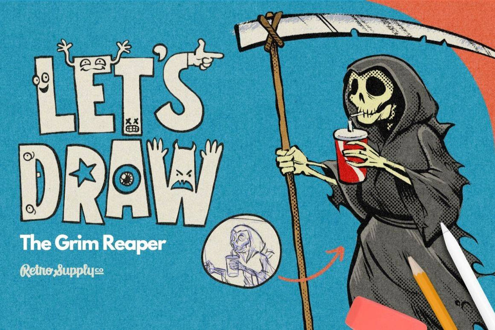
We're kicking off our Let's Draw series featuring ToadyCo by diving straight into something that's as dark and metal as it is fun...The Grim Reaper!

Yep, you read that right. Our first episode is all about bringing a touch of whimsy and character to one of the most iconic figures in folklore.

Products Used

  • Standard Pencils. Mattheew uses the Standard Pencil #3 from this pack for preliminary and final sketches. Keep it loose, simple, make mistakes, and find your proportions.
  • Standard Pens. A simple but powerful set of pens perfect for inking a wide variety of illustration styles. Matthew is using the Ramen Brush saying “it has great texture, and it's expresive, and it gives you nicely varying line weights,”.
  • DupliTone. Made from our archive of 10-90% tonal halftones, these brushes are a nice touch to add depth, visual interest and an analog feel to your work.
  • Phantom Paper. High-resolution, seamless paper textures that are seperated into layers of texture and highlight so you can get the look of your work actually being printed on paper.

You can complete the tutorial without the products — just not with the same analog swagger. Okay, let's get to it!

We're drawing The Grim Reaper here but the method of illustration is important. Why? Because it's deceptivily simple yet powerful.

  1. Start with a loose preliminary sketch. The idea here is to get the pencil moving. Don't worry about anything but starting at this point. Matthew starts with a blue pencil becauseit gives our brains a cue that this is really a sketch. Keep it loose, simple, make mistakes, and focus on finding proportions. You can't see it in the video but Matthew has reference images. We recommend you use references as well.
  2. Use selection and transform tools. After your initial sketch is coming together use your softwares selection and transform tools to squish and stretch your forms into the right shape. Don't worry about anything getting overly distored. Remember, this is just the prelimary sketch.
  3. Create a new layer and trace over your sketch. Using the preliminary sketch as a sort of scafolding create a new layer and start to refine your sketch and add more detials. Repeat on as many layers as necesary until you are happy with the results. Matt's using the Ramen Brush from our Standard Pens, beloeved for it's toothy texture and expressive lines.
  4. Add halftones or other details. To add more depth and visual interest to your work create a new layer and start adding halftones. These will add an analog feel and the 10-90% tonal range of halftone brushes will let you layer beautiful and seamless inky halftones.
  5. Color your work. Create a new layer for each color. This makes it way easier to edit your colors layers (perfect if you don't get your color palette right the first time like just about everyone).
  6. Add finishing effects (optional but awesome). Give your work a true analog texture with one of our paper texture packs like Phantom Paper Vol. 1, Phantom Paper Vol. 2, or our Paper Boy textures. These texture packs are set up for you so you can drop your work into them or paste them into your work.

Wrapping Up

We hope you've enjoyed the first episode of Let's Draw. Stay tuned for more episodes that we'll be releasing in the coming weeks.

Don't forget (and this is really important... don't just watch the video. Do the drawing right now. Then post it on Instagram with the hashtag #RSCOLetsDraw. We'll be keeping an eye out for folks tagging us so we can share our favorites.

About the Artist

Matthew Shultz grew up in Michigan obsessed with comics, cartoons, role playing games, and fantasy movies.

His favorite things to draw are still creatures and characters that wouldn’t look out of place in a television advertisement for action figures from 1986.

He lives in Seattle with his spouse, children, and several excellent animals. He hopes you enjoy his artwork, and he would be glad to make some for you.

Follow ToadyCo on Instagram