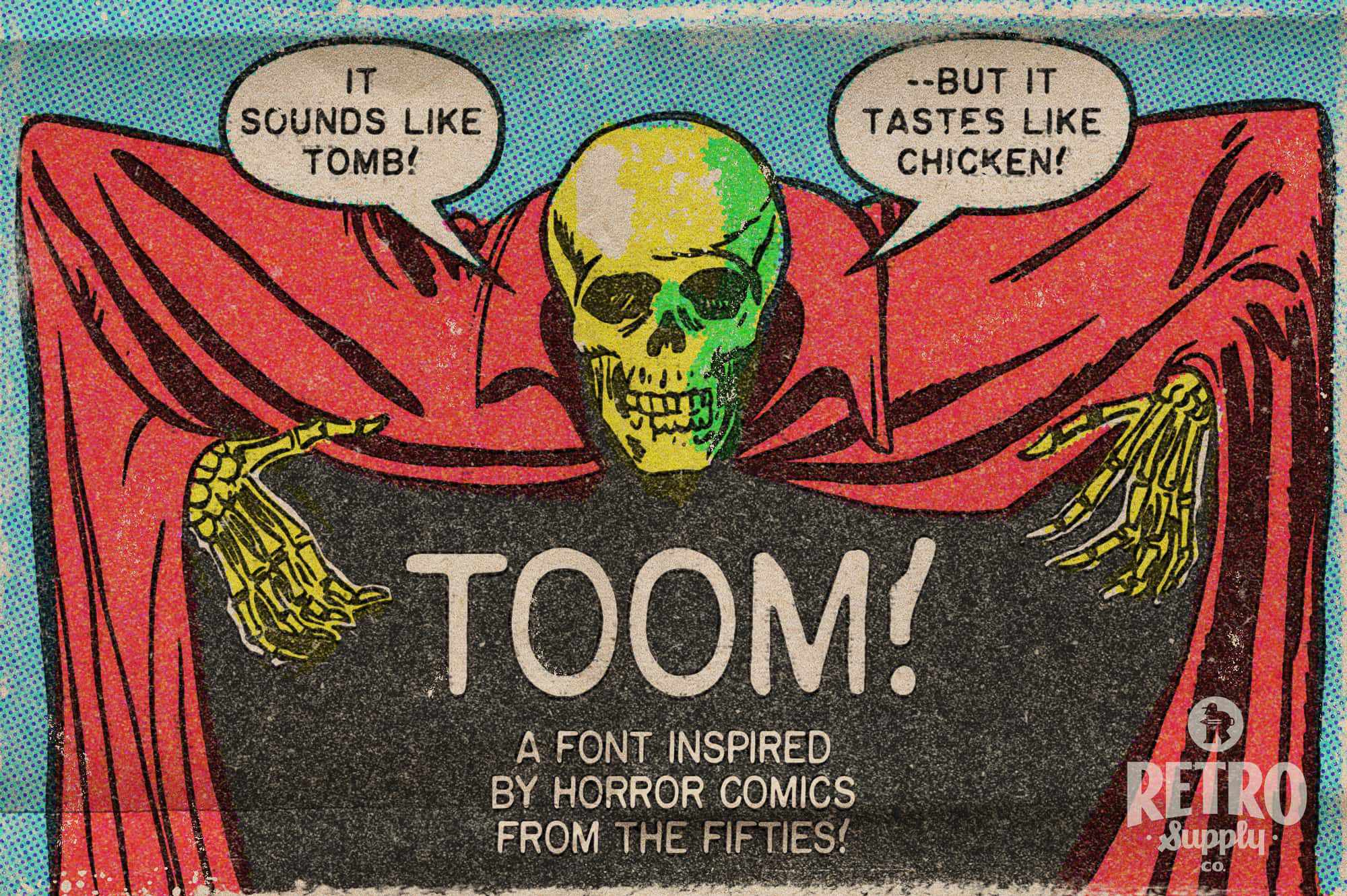


TOOM
$30.00 USD
Please select all options.

No worries with our 30-day money-back guarantee on individual products.
Learn More1950s horror comic publisher EC Comics did something subtle and creepy.
They used a machine to emulate hand lettering mechanically. The Leroy Lettering System emulated the look of handwriting but with a lifeless consistency.
Imagine desktop publishing but on a rickety device that has subtle inconsistencies.
Now you can capture the same creepy classic look with TOOM — our new font by artist, writer, and university professor Christopher Sperandio.
- 3 all-caps faces (Regular, Italic, Bold Italic).
- Includes punctuation, special characters, and essential comic characters. including copyright, trademark, and reserved symbols.
- OTF file.
- Support for European languages.
- Extras like skulls, excitement lines, and misprinted characters.
- Made by artist, writer, and university professor Christopher Sperandio.
Recently, I found I needed a new font for my new graphic novels, so I made a digital version of the Leroy Lettering System. Fans of old comics will recognize Leroy Lettering. Bill Gaines, publisher of EC Comics, employed Jim Wroten, a former Leroy Lettering System salesman, and his wife, to letter ALL of their books. The use of Leroy Lettering made the EC books distinct.
The font I made is called TOOM, its name a mash-up of TOON and TOMB, a tribute to the primary use of the Leroy Lettering System in 1950s horror comics.
Since authoring this font, I’ve used it in my new graphic novels and my contributions to comics anthologies such as š! from kuš! komiksi based in Riga, Latvia, and Kutlul, based in Berlin and Rotterdam, and in the daily comics that I make and post on Instagram.
- Chris Sperandio
- DSDavid S.Verified BuyerReviewingTOOMI recommend this productRated 5 out of 5 starsMy new standard choice
This is an excellent clear font that reads well looks nice and is not too cartoony overall I think it’s my new go to font whenever I do comic book Work or general captioning
- AAnoVerified BuyerReviewingTOOMI recommend this productRated 5 out of 5 starsGood font
Pairs well with the KraftTone pack.
- SMShane M.Verified BuyerReviewingTOOMI recommend this productRated 5 out of 5 starsIncredible font
Exactly what I needed for a current project, for historical accuracy. And your graphic design is fantastic and hilarious!
- TWTim W.Verified BuyerReviewingTOOMI recommend this productRated 5 out of 5 starsThis is the font!
There is something about this font that brings me back to my love of horror comics. I have already found it indispensable for one design.
- ESERIK S.Verified BuyerReviewingTOOMI recommend this productRated 5 out of 5 starsTOOM!
Great font with a retro EC feel.