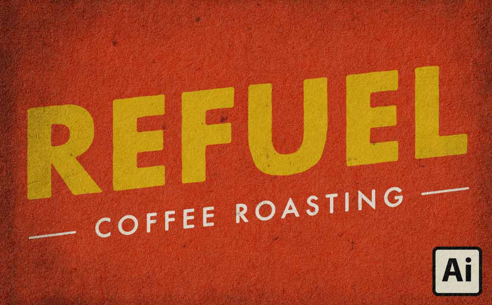
In this quick tutorial, I'll share a pro tip for giving your typography a subtle grungy, roughened effect. It's perfect for adding an old print effect to your designs, and the imperfections can even create a handlettering feel.
Do you like these kinds of tutorials? Let me know in the comments and I'll keep making them!
Also, if you have any requests for the next short tutorial let me know and maybe I'll make it!
Stuff used in this tutorial:
Futura Bold
Yeah, it costs money. But it's such a great font it really does pay for itself. So if you don't already have it be sure to pick it up next time you have some extra cash! If you need something free and kind of similar you might try Source Sans Pro.
Standard Issue Subtle Grunge Textures
This is a massive collection of subtle grunge textures ready to add to your work fast. We've also specially process them so they look great out of the box. Just place them on top of your work and set the blending mode to Multiply, Linear Burn, Color Burn, or Screen.