The ABCs of Color Theory

The ABCs of Color Theory

Before I get into color theory, I have a confession to make. I will reveal a secret I’ve kept for the last forty years.

As a young art student, I sought a class to satisfy my degree's math and science requirement. I thought I found the perfect compromise – I didn’t want to take ANY math or science, so I enrolled in a class called “Physics of Light and Color.”

In that class title, I saw “light” and “color.” I didn’t account for the “physics” part. I am terrible at math and physics is like super math. The class was challenging for me. What’s worse is it was right after lunch. I fell asleep during every lecture.

We were in a big hall. I sat in the back and felt invisible. I was not invisible. Having been a professor for nearly two decades, I notice people falling asleep when talking to them, no matter the audience's size. I owe that professor an apology. I got a C in my physics class and was lucky to get that. I did learn a lesson, though. One shouldn’t name one’s class (or one’s article) something IF one does not plan to keep that promise.

For my part, I swear that this article is on the ABCs of color theory, albeit written by a C student in the physics of color. I will tell you three things about color, in the order of A, B and C. And just for you, I will throw in the letter D for free.

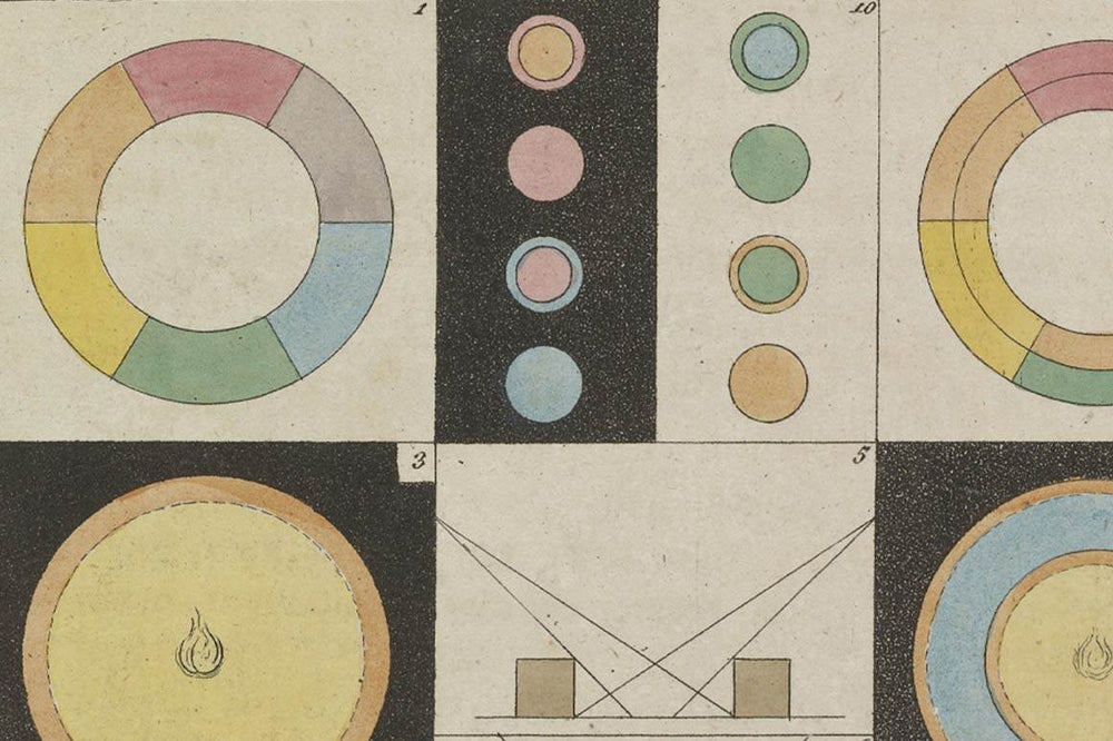
Detail from Johann Wolfgang von Goethe, Zur Farbenlehre [Theory of Colors], Tübingen: J.G. Cotta'schen Buchhandlung, 1810

A is for Art (History)

The following should go without saying, but given how this country underfunds art education, I will say it. Color theory is the field of study that examines how colors interact with each other and their use in art. 

Aristotle was the first color theorist. His theories held sway for two millennia. As you would expect, Aristotle thought the gods and the four elements were involved in color. But here comes the physics. Sir Isaac Newton entered the color game and began experimenting with prisms, splitting natural light into seven visible colors. He was the first to “taste the rainbow,” I suppose.

We have Newton’s book, “Opticks” to thank for the creation of our friend Roy G. Biv, the mnemonic device used to help us all to remember the colors red, orange, yellow, green, blue, indigo, and violet – better known as the colors of the visible spectrum.

Two-hundred years later, Johann Wolfgang von Goethe got in the color theory game and wrote on the physiological aspects of color. Or as he put it, “Colour are light’s suffering and joy.”

Detail from Johann Wolfgang von Goethe. Zur Farbenlehre [Theory of Colors], Tübingen: J.G. Cotta'schen Buchhandlung, 1810

There are some truly great resources on the history of color theory. I delight in seeing old color charts and associations. In 2017, the Smithsonian mounted an exhibition on color. Although it is six years old, their web site has useful and relevant information on the history and (Zzzz…) the science of color.

Understanding the history of color theory is useful, relevant and interesting. However, it may put YOU to sleep. I won’t judge you.

“The Birth of Venus,” Sandro Botticelli, tempera on canvas, probably executed in the mid 1480s.

B is for Build Your References

Everybody has their own set of opinions when it comes to color theory. In my case, I think of color as a tool, as a part of a design kit and that it’s there to do a job. That job could be to help convey an emotion, or it could be there to help control how the viewer reads a piece, or both, or something else.

The best way to build your personal color theory is to find color references, instances in other designs where the color speaks to you. 

When I was a kid and got a new toy, I wanted to take it apart and see how it worked. I got scolded often for “breaking” my toys. It wasn’t willful destruction. I was hungry for knowledge. I carry that approach to this day. If I see an artwork or a design I like, I first grapple with the art emotionally and intellectually. My next step is to try to understand how it works.

Museums don’t allow people to dismantle the art so you can figure out how it works, but nobody can stop you, for our purposes, from boiling down a color palette to understand it. With digital tools like Photoshop, it’s easier than ever to pull apart images to understand them better. And no toys or artworks are harmed in the process. 

When I find an image with an attractive color scheme, one way that I examine it is to open it in Photoshop and use the filter “crystalize” on it. “Crystalize” fragments the image into chunks of color, simplifying things and abstracting the image so that I can focus on the artist’s color choices.

In addition to narrowing down the color scheme, it also makes the amounts of various colors used more recognizable. Making things simple is essential for me, because remember I have the brain of a C physics student.

“The Birth of Venus,” crystalized in Photoshop.

“Color is the place where our brain and the universe meet.” Paul Klee

C is for Who Cares if I Got a “C” Forty Years Ago?!

The topic of color theory is only helpful to artists if we can turn the ideas into practice. I may be bad at physics but I think I’m reasonably good at color.

My first practical advice is to get to grips with understanding color spaces. It is the advice I give my students. I’m now offering it to you. Do this first. Always. 

The colors (light) that enters our eyes from a screen are different than light (colors) that bounces off of a page printed in CMYK, the standard commercial printing colors, and is different than the whatever that bounces off of a painted surface.

Think of the various color spaces as overlapping shapes in a Venn Diagram. There is color on your screen that CMYK cannot reproduce. A painting can have colors that a screen or print cannot yield. 

As an artist or a designer, the first question you have to ask yourself concerning color is, where is this going? Are you making art for a screen? Are you going to print it? How will you print it?

The color space for CMYK printing is VERY different to the color space available in Risography, as an example. To use color successfully, you have to know what medium you’re designing for, because the color spaces, the Venn Diagram has overlaps – but there are also exclusions!

To get started, do a little research on color spaces.

Various color spaces.

Finally, as promised, here’s some extra advice.

D is for Don’t Fall Asleep in Class! You May Miss Something Useful!

I will leave you with two parting practical things you can do. Bookmark this page so that if you DO fall asleep, you can come back to this again later. 

The first is that there is a powerful online tool that Aristotle could only dream of. An excellent color shortcut is available for Adobe users. The Adobe Color Wheel, online at 

LINK: https://color.adobe.com/create/color-wheel 

is a fantastic tool that lets you manipulate colors to get your dream harmonious (or aggro) color scheme. Bear in mind that this is a screens-based solution. 

The second piece of advice is free, but it will cost you. If you’re making things for offset CMYK print, you could be in for some big (and bad) surprises. Of course, you can use a tool like the Adobe Color Wheel if you’re heading to print but you should also invest in a CMYK color swatch guide.

These printed guides show you what your colors will look like when printed. The bad news is that the good ones aren’t cheap. The cheap ones aren’t good. Investing in a CMYK swatch books is a good idea if you plan to be in the business. Think of it as color insurance. I have one and it has saved me from some embarrassing mistakes.

Printed color charts helps designers to avoid problems.

Risograph, another printing tool, has a more complex relationship with color. RetroSupply has a some Riso resources that you should investigate. 

In closing, here’s one more piece of advice. Consider taking a deeper look at color theory, especially the work of the faculty of the Bauhaus school. Wassily Kandinsky, Johannes Itten and Josef Albers contributed significantly to the understanding and deploying color, not just in theoretical terms but also practically.

About Christopher Sperandio

Christopher Sperandio is an artist, writer and university professor. In 2015, he founded the Comic Art Teaching and Study Workshop at Rice University, where he teaches art and comics. Sperandio has produced several comics fonts for RetroSupply including TOOM, and others. Sperandio writes a bi-monthly micronewsletter on art and comics. You can find Sperandio’s popular political comics on Instagram.