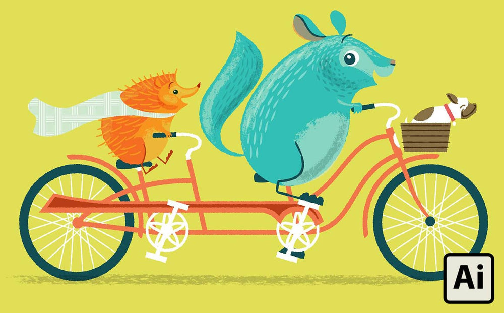
Here’s the process I created for creating a vintage/modern/analog illustration look using vector brushes in Adobe Illustrator for a new children's book Chin Up, Chinchilla, written by Beth Stafford and illustrated by Jeremy Slagle of Slagle Design.

The style for this book was inspired by the simple Little Golden Books illustrations my mom read to me when I was little. With some trial and error I figured out how to do my version of the details I love about this classic style.

In this tutorial, you're going to learn:
- How to combine simple shapes to create an expressive character
- How to make your own custom Illustrator brush
- How to use existing brushes from RetroSupply Co.
- How to manipulate brushes with the Width tool
- How to add some non-destructive texture to your illustrations with the Roughen filter
Document Set Up
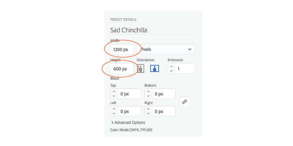
In Adobe Illustrator (I'm using CC version 22.0.1), start by creating a new document. Go to File > New (⌘N). For the purposes of this tutorial, make the document size 1200px by 600px, landscape.
Mix Up Some Colors
Create four new color swatches.
- In the top menu bar, go to Window > Swatches to enable the Swatch palette.

- In the Swatch palette, click the new color icon on the bottom (it looks like a page with a folded corner). In the Swatch Options pop-up, set the color type to Process Color.
- Check the Global box, add the CMYK color mix percentages and click OK.
- You’ll need to do this for each of the four colors shown below:

Creating the Basic Shapes

The Body
Start by drawing a simple shape with the Pen tool. I’m basing the body of the chinchilla on a simple “bean” shape.
- Use the Pen tool and only place points on the outermost and innermost points of the curves where you can drag the bezier handles at 90 degree angles.
- Fill it with Chinchilla Blue in the Swatches panel.
The Head
- Next, draw the head shape. In this illustration, he’s looking off to the left.
- Fill it the same color as the bean.
- Use the Pen tool to add a couple inverted petal shapes for the ears, and color them the same color as the body.
Flatten the Bottom
- Draw a rectangle over the lower part of the bean where his body rests on the floor. Select the rectangle and bean shape (holding down the Shift key to select multiple objects) and open the Pathfinder panel. Select the Subtract icon to flatten the bottom of the bean.

The Tail
- Using the pen tool like you did above, draw the shape of the tail and only put points on the outermost and innermost points of the curves where you can drag the bezier handles at 90 degree angles.
- Fill it the same color as the face and body.
Adding Some Details

Make the Inner Shapes
- From the Tool panel (Window > Tools) using the Pen tool, create the inner shape of the face and the Ellipse tool (also in the Tool panel) to draw a small oval for his tummy and three circles that form his eye.
- Fill the largest and smallest eye circle with white and fill the middle sized circle with Dark Blue in the Swatches panel.
Draw the Lines that Distinguish His Haunches and Rear Legs
- Using the pen tool, draw simple “C” shapes that start inside the body shape with a horizontal leg the extends outside his body shape and align with the baseline of his body. Remember, the goal is for your character to look hand drawn when you are done so don't stress out about differences or trying to make him look symmetrical.
- Using the Swatch panel, make all of these lines Dark Blue and fill them None.

Make the Eye Appear within the Inner Face Shape
- Use the Pathfinder panel (Window > Pathfinder) to create new shapes by combining or removing parts of existing shapes. Duplicate the existing inner face shape by selecting it and go to Edit > Copy (⌘C) then paste in front by going to Edit > Paste in Front (⌘F). Though you may not see it, you just made a new shape directly on top of the one you copied.
- Now select the new shape and the outer white shape of the eye (you can select both shapes by holding the Shift key while you make your selection).
- With both selected, open the Pathfinder panel. Under Shape Modes: select the Intersect icon. You can see by the icon that we are going to make a new shape where the white circle and the inner face shape overlap. You should now have a white eye that looks like the one above (R).
- Repeat this step with the inner face shape and the dark blue pupil of the eye. It should now appear to be contained within the inner face shape as seen above.
Draw the Nose and Inner Ear Shapes
To create the pink nose and inner ear, use the same technique as above.
- Draw a shape with the Pen tool that intersects with the shape you wish to overlap. The new shape you create will be made from where this shape overlaps the shape below.
- Duplicate the bottom shape, select both shapes you wish to overlap and click the Intersect icon in the Pathfinder panel. You can make them pink by changing the fill setting in the Swatches panel.
Blend the Nose Using Transparency
In order to make the pink a little more subtle so it blends in with the blue fur, I adjusted the opacity of the nose and inner ear shapes by going to the Transparency panel (Window > Transparency) and changing the opacity to 68%.
Applying Texture with Brushes and Roughen
Use brushes to add texture for an analog, hand-drawn look. Brushes are the icing on the cake!
- Use the pen tool to make a small “leaf” shape. Duplicate the shape by selecting it and dragging the shape while holding the option key.
- Adjust the leaf shape by moving the curve handles and points to make it look a little different.
- Continue to duplicate and differentiate shapes until you have a cluster of shapes similar to the illustration below.

- Select all of the leaf shapes and drag and drop them into the Brushes panel (Window > Brushes). A pop-up window will prompt you to chose the kind of brush you wish to make.

- Select Art Brush then click OK. A second dialogue box will appear.
- Name your brush “Fur” and set the colorization method to Tints. This will allow you to change the color of your brush in the swatch palette. If you find that you are unable to color your brush, chances are you forgot to set this. You can also double-click the brush in the Brushes panel to make changes to the brush options.

For the remainder of this section, I’ll be using brushes made by Retro Supply Co. You can purchase them from their website in sets or make your own brushes by breaking out the Sharpies, Crayolas, charcoal, brushes and paint.
For this illustration I'm using brushes from the Drunk Sailor, Wax and Oil, & VectorFuzz pack (although they just came out with a pack called Gouache Shader Brushes that works great as well).
Scan the textures and trace them in Illustrator with the Image Trace feature. You can drag and drop the traced textures into the Brushes panel like we did a few steps back.

Brushes are super flexible and customizable.
To use a brush, draw a line or curve with the Pen tool. While it is still selected, click the chosen brush in the Brushes panel. You can adjust the overall thickness of the brush by changing the stroke weight in the Stroke panel (Window > Stroke).
You can even type in decimals like .25, .5, etc to make them even smaller. You can color a brush by changing the stroke color in the Swatches palette.
You can get really get crazy and use the Width tool to taper, thicken and thin the brush along a path as shown above. With the Width tool selected, click anywhere on the stroke path to add a point and drag the handle in or out to set the width.
You can taper the ends by placing a point at the farthest edge and adjusting the width inward. Note that Width tool points and the points made to create the path are different. This can be confusing at first but with some practice you’ll get the hang of it.
Brush Tips:
- If you hold the option key while pulling a Width tool handle, you can adjust the width on each side of the path independently to get a really custom look.
- It’s best to set the stroke weight of your brush as close as possible before using the Width tool. Once you have used the Width tool to make adjustments, changing the stroke weight can throw things off a bit and require you to go back to the Width tool for further tweaking.
- Don't add too many points. The fewer you use, the more natural it will look.
- If you wish to change the direction of the brush stroke, you can select the brush path and click the endpoint that you wish for the brush to start on with the Pen tool. This will reverse the direction of the stroke along the path.
Apply Brushes to the Chincilla
- Using the Pen tool, draw the five paths shown above (L). Four on his body and one on his tail.
- With those paths selected (remember to hold Shift while selecting multiple objects) go to the Brushes panel (Window > Brushes) and select the new Fur brush you created. You should now see your brushes in use!
- Use the Stroke width setting (Window > Stroke) to thicken or thin your brush to the desired weight.
- Next, use the same method to create the Oil Brush textures shown above (R) but this time choose the Oil Brush rather than the Fur Brush.
Coloring the Brushes
- For the darker brushes, set the color to Dark Blue in the Swatches panel (Window > Swatches), and set the opacity to 20% in the Transparency panel (Window > Transparency).
- For the lighter brushes, fill the strokes Chinchilla Tummy Blue in the Swatches panel (Window > Swatches), and set the blend mode to Screen and the opacity to 45% in the Transparency panel (Window > Transparency).
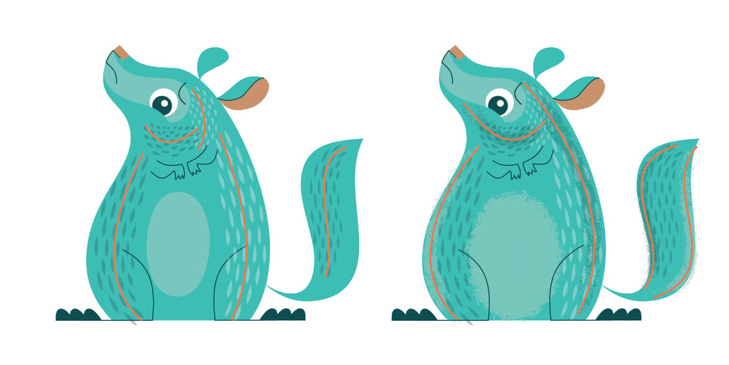
Apply Roughen
If brushes are the icing on the cake, Roughen is like the tasty pink icing flowers on top!

- Add Roughen to the basic shapes of the chinchilla by selecting them and applying the Roughen effect. Go to Effect > Distort & Transform > Roughen. In the dialogue box check Absolute, set the Size to 2.5, Detail to 30 and the Points to Smooth. You can tweak these settings to your taste. For smaller elements like eyes, toes, etc, you may want to set them separately as the effect may be too harsh. Set the size to a smaller number like 1 or 1.5.
Roughen is non-destructive, so you can always select an object with Roughen applied and adjust it in the Appearance panel (Window > Appearance).

Whew! You're done! Now go and apply your newly-found techniques to add that vintage storybook look to your own work.
About the Author
Jeremy Slagle is a designer and illustrator at Slagle Design, based in Columbus, Ohio. You can follow him on Instagram, Dribbble, Twitter and Facebook or visit his website at www.slagledesign.com.
You can find out more about Chin Up, Chinchilla at www.happycargobooks.com