In this tutorial, we’re going to teach you how to make a 60’s inspired Valentines card using the iPad Pro, Procreate, your Apple Pencil and some great RetroSupply products out of these packs:

Inspiration
Anytime I start a new project, gathering inspiration is key. I have loads of reference ready on my iPad.
I like to even keep folders with specific types of reference I know I’ll be needing frequently, separated into categories. This way I don’t have to go sifting through all the art and inspiration images I’ve got, every time I start that type of project.
That being said, I already had a decent sized chunk of Valentines ready for this very occasion!
I like how soft and round the character’s features are in most old Valentines. I also like how they use a large heart as a design element. This fills a lot of space, gives your text a place to live and makes the image immediately recognizable as a Valentine.
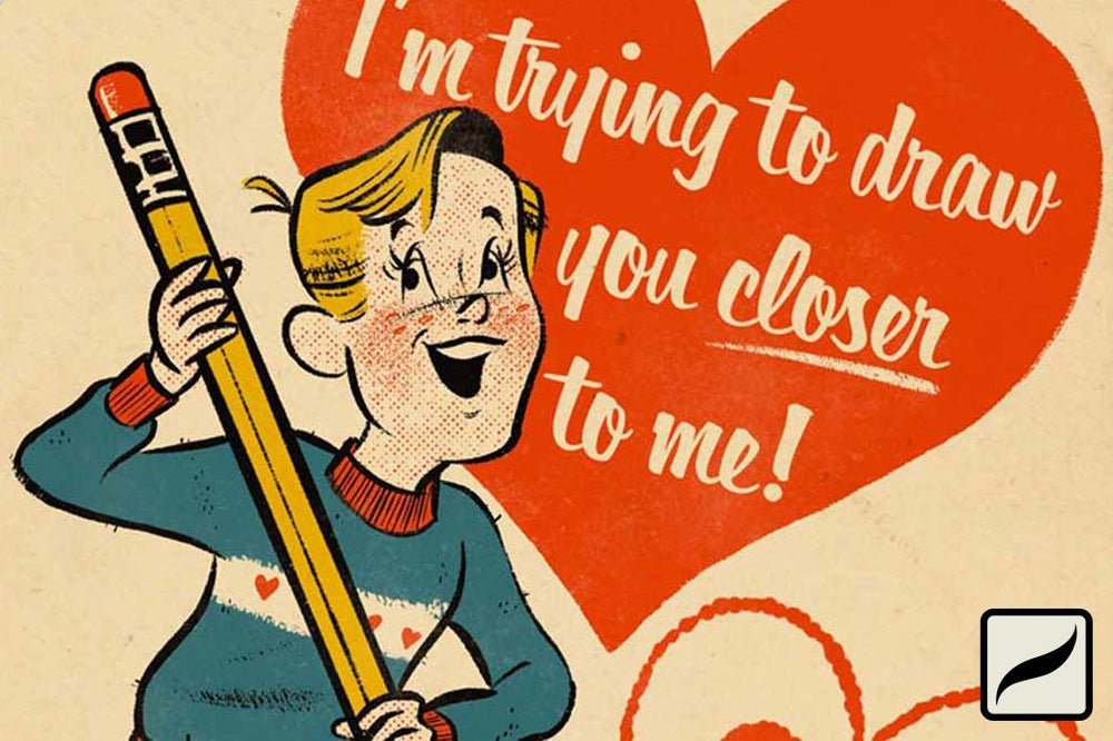
I also like how they revolve around a cheesy pun. Since we’re making this with artists in mind, I’ve come up with “I’m trying to draw you closer to me!”.
Sketch
I start sketching on paper with a red pencil. Sketching this way feels most natural to me and allows me to get a look that feels more “classic” and “by hand” in the end. I use red pencil so that when I start inking, it’s easier for me to differentiate the lines I’m making for my final piece.
The old Valentines I like tend to take the phrase they are using and exaggerate it for the card’s image. Playing off of the “draw” part, let’s use a giant pencil and have our lovesick character hold it to write out our message.
I loosely sketch out the building blocks for our character to determine the size and placement. Then I refine that structure to give weight and definition and, eventually, character. It doesn’t need to be perfect, just enough to give you guidelines to work with in Procreate.
Take a nice, flat picture of your sketch with the iPad. We’ll be using this to create your final drawing.
Create Your Canvas
A good, standard card size is 5x7. Let’s create a 5x7 canvas to start with in Procreate.
Once you have your canvas, import your sketch. Stretch and rotate it so that it looks good on the canvas. Be sure to leave room for the To: and From: section at the bottom and also some room for your text.
Turn down your sketch layer’s opacity so that the sketch is visible but not distracting.
Ink
Create a new layer above the sketch layer. This is where you’ll create your main linework.
Using the Ramen Brush Pen brush from Standard Pens for Procreate , I start drawing my character. I’m starting with the outline of the face and then the hair. I like to use the edge of my Apple Pencil to get the brush to scatter a bit for texture in the hair.
classic inking pens
This set of custom inking brushes for Procreate are the only pens you'll ever need. Each brush has been made to deliver the retro looks you love.
I turn it’s size down some to create the face of the character, so I can achieve more subtlety with my lines there.
I drew my pencil on a separate layer so that I can play with its size and placement. I love Procreate’s autocorrect feature for making the long, straight lines of the pencil. To use this, draw your line and don’t let go at the end. This will change your line from all wiggly into a nice straight line you can drag to extend or change the angle of.
While inking, I also decided to stretch out the legs a bit. Once I got to the hips, I just stretched the bottom area of the sketch until it looked more like how I wanted and then continued to draw over it in my ink layer.
Color Fills
Create a new layer under your linework, this is where your first color fill will go. Starting with red and using the Ramen Brush Pen brush from Standard Pens for Procreate, start to color inside your lines just like you would in a coloring book. Because you’re behind your linework, you don’t need to worry about covering up any details.
Go through, creating a new layer for each color, and keep coloring until all your main areas are filled. Keep the amount of colors you use to a minimum. This will help keep your piece believable as a cheaply printed old card.
Halftones
For the areas that need color but not quite the vivid fills we’ve been doing, we’ll be using halftones. Create a new layer underneath your linework. Using the Extra Rough Halftone 02 brush from TransferTone, go through and fill in the pants of your character. Use the eraser to go around and clean up anywhere that the brush broke outside of the linework.
DRY TRANSFER PATTERNS
A collection of retro pattern brushes, inspired by dry transfers of the 1970s and 1980s.
Now, go through the other colors you’ve used and create new layers with halftone fills. I did this with the red where his skin is and with the yellow at the sharp end of the pencil.
After that, I gave him rosy cheeks using the RetroFuzz 32 brush from the RetroGrain Brush Pack.
GET THE GRAIN
Add the perfect grainy texture to your illustrations with this Procreate brush pack of 33 diverse grain shader brushes made from historical paint samples.
Heart
Create a new layer and sketch out where the heart will go.
Now, go to your red layer and draw a refined version of that heart, using your sketch as a guide. Pull your color over from the upper right hand corner and drop it within your linework to fill.
While still in this red layer, I created the heart coming from our character’s pencil. To make it feel more hand drawn and cute, I used the Runny Fountain Pen from the Standard Pens Pack.
Paper, Texture, Text & Cutout
Now we’re going to add in that old paper texture to make it feel like a real life old card.
In the upper left, go to the wrench icon, click it, then Insert A Photo. Find your image of an old envelope from the Paper Artifacts Bundle.
GET THE PAPER
A collection of hand-picked textures from teh RetroSupply library. A powerful way to breathe lifelike and immersive touches to your digital work.
Once imported, stretch the envelope so it covers your canvas without the stamp and edges showing.
Bring this layer above all your other layers. Click the N to the right on the layer, next to the checkmark. This brings up another menu with blending options. In that menu, change the blend style to Multiply.
Click the wrench icon again. Under the Actions menu, select Add Text. Type our message here. Then, go to Edit Style in the upper right of the keyboard it brought up. While here, change your text color to white and find the font you will be using.
Now stretch and resize your text so it fits within the heart. Use the selector tool to cut your text out and paste it into multiple lines.
Create a red bottom bar for the To: and From: area. Create and place your text for these just as we did before.
Using the selector tool again, select the two areas within your red bar where names will go. Once selected, go up to your layer and click twice on the layer’s thumbnail. This will bring up some options. From those options, select “clear”. This should clear two blank areas for the name fields.
Cutout and Ink Texture
Now, using the eraser with the Ramen Brush Pen brush, erase the top edge of the old paper to look as though it were cut around the edge of the heart and pencil, leaving a blank area along the top.
Now select the paper layer again. Go to the wrench area and select Copy. Then paste a copy of your cutout paper layer. We are going to use this to create your paper’s shadow.
Go to the little magic wand icon in the upper left. Click on Hue, Saturation, Brightness. Bring the brightness down so that this layer is a much darker tan color.
After that, go back to the magic wand menu and select Gaussian Blur. Tap and hold the screen and pull from left to right. This uses the screen as the slider for the strength of your blur. I blurred my darkened paper to about 13%.
Go back up to your layers and select the original, not blurred or darkened, paper. Click the thumbnail of the layer and in its menu, click Select. Once selected, go to the blurred paper layer, click it’s thumbnail and then click Clear. This clears everything where the original paper layer hits and leaves just a light shadow around the paper’s upper edge.
Finally, let’s create some ink texture on our completed card design. Create a layer above your black linework and below your paper texture layer. Set the layer’s blend style to Screen.
Using the Inky Grunge brush from the SpaceRanger pack, in the color white, go around and lightly tap areas to give a cheaply printed ink look. Pull down your layer’s opacity so that the ink grunge look isn’t too heavy. We want this to be pretty light.
Ok! We’re all finished. Time to export this thing, print it off and shoot your shot. Best of luck!!
ABOUT THE ARTIST
Robin Banks is a self-taught artist and illustrator living in Salt Lake City, UT.
Robin has been a RetroSupply resident illustrator since 2019.
Their work can be found on Instagram @ramenbanks or on their web store robinbanks.bigcartel.com
Comments
Theresa
Love this! Perfect caricature! Looks just like you, Robin.
March 14, 2022
Lucia
Love this tutorial!!
March 14, 2022
KJ
OMG – loved this tutorial So clearly written. Thank you!
March 12, 2020
Dustin
And the Winner is…
Brian Fuelleman!
There were SO many great tips in the comments. I seriously might make a blog post or little PDF cheat sheet out of them. But Brian’s just hit my retro nerd buttons.
Check out this great tip:
“Collecting reference material for looks or characteristics can save you tons of time, even if you just keep it as digital files/scans. Building banks or collections for periods or looks lets you do your work with a solid foundation for design, and can also help you avoid linguistic mistakes by using words or phrases that may have completely different meanings in the context of the given era.”
Thanks to everyone for participating and being a part of the RetroSupply community (and be sure to check your email — we made sure everyone gets a runner up prize).
February 11, 2020
Brian Fuelleman
So far, some really good tips, I’ll throw in my two cents worth too.
Save your work often, while it takes some time, it saves you from losing everything should something go wrong during the process.
For “retro” work, keep the fonts/lettering styles to fit the time period sand theme of your work.
Flag/tag your fonts for characteristics crucial for the work you do. Maybe add notes stating what fonts you used on a particular job or project, this gives you reference material in the future when you need to capture the same feel or look used in a prior project.
Collecting reference material for looks or characteristics can save you tons of time, even if you just keep it as digital files/scans. Building banks or collections for periods or looks lets you do your work with a solid foundation for design, and can also help you avoid linguistic mistakes by using words or phrases that may have completely different meanings in the context of the given era.
February 11, 2020
Madison
I like to make a detailed plan of what I’m going to do the week before the deadline. By breaking it up day to day, I don’t fall into the trap of doing it all the night before.
February 11, 2020
Madison
I like to make a detailed plan of what I’m going to do the week before the deadline. By breaking it up day to day, I don’t fall into the trap of doing it all the night before.
February 26, 2020
Adam E
Love this post! Along with finding inspiration (one of the most important elements of preparation!), my best tip for getting a project done fast is advice that I often neglect to heed! Avoid perfectionism as much as possible – especially with retro-styles. Try to do a rough draft from beginning to end before going back for touch ups. This helps to see the big picture more clearly, and a lot of times you can keep many of your design elements ‘as is’! It’s easy to keep going back and refining things, but we need to remember that sometimes the rough, ‘unfinished’ look is what we were going for in the first place.
I can’t count how many times I’ve looked at a early-stage screenshot of a design I was working on, only to find that I like the earlier design much much more!!
February 11, 2020
William
My best tip for getting a print job done quick? Set up a schedule with a deadline that forces you to get your parts of the work done quickly. That way, you have more time and flexibility with the parts of the job that are out of your control.
February 11, 2020
Paul Hallam
Great tutorial and a good use of various tools to create an authentic vintage look.
I think the key to getting a print job done fast is to make sure I don’t rush the beginning foundational steps of concept, composition, the basic sketch and colour planning. If I get these right, then the rest of true illustration is a breeze. If not- then I need to go back and redo things which eats up time.
February 11, 2020
Zachery A. Dominguez
The end product turned out great, I wouldn’t have known it wasn’t made 70+ years ago! All those subtle textures and brushes make a world of difference.
February 11, 2020
Alan Borden
Excellent tutorial! My best tip is to work fast to meet your deadlines is to have a solid drawing/starting point, and also to have as many Retro Supply plugins as possible, because they really do give you that vintage look in half the time.
February 11, 2020
Sean Nemetz
This was nice, I love how some brushes make you feel like a genius. My tip for getting print stuff done on fast is to now waste spend the whole day on the internet.
February 11, 2020
Dana
Already told Robin on Instagram I loved this tutorial! Clearly written! My best tip for finishing a print project fast — build it with the end in mind, right from the beginning. Add bleed to the doc, if it will bleed, build colors as CMYK so you don’t have to convert before going to press, make sure any images are also already converted to the correct color profile (assuming you know your printer already) build in layers to make edits quickly if others will be weighing in. And, ask your printer if they can gang your project with something else going on press immediately if the paper will work for your design/client/budget. Those are my tips!
February 11, 2020
Lori College
Great tutorial. Timely and helpful for all kinds of projects.
February 11, 2020
John Otero
Tips to organize yourself and SPEED UP! Do Your Research Ahead of Time, Consider Digital Printing, Ensure you send Print Ready documents, Send Your Print Ready Documents Digitally, Specify Your Ink Colors, Expect Delays for Unique Projects, Proof Your Work,Use Your Printer’s Fulfillment Option. Awesome job on all the retro designs! Love this aesthetic!
February 11, 2020
ROBERT MICHAEL PUFAHL
I work in a small print shop where most of our customers don’t know what bleed is. So I use a technique I call “Faking the Bleed”. It’s faster than explaining bleed to some marketing intern who won’t even still be working for the client in a month and helps to stop workflow interruptions. In InDesign I copy and place in place. Then I drag from the center-left edge of the frame all the way to fill the bleed on the right. Repeat on the other side. Then you select all three frames and repeat the process for the top and bottom. Even if it’s a photograph, it’s less noticeable than no bleed at all if there is a miss-cut in finishing.
February 11, 2020
Daniela Silva
Que hermoso trabajo y muy bien explicado. Muchas gracias.
February 11, 2020
Marnie Hilash
Glad to see an example of using a selection from one layer to clear another, a favourite technique I have had trouble implementing in Procreate – hope reading this makes it doable next time I want to make it happen.
Best way to get a fast result on a print project? Clear ur schedule, eliminate distractions, and don’t fall into the procrastination trap. Unfortunately, the best way of avoiding procrastination is to pursue your project to avoid something else you really do not want to do. Therefore my house is a mess but I turn around all my commissions on or before deadline!
February 11, 2020
Carlos Carrion
Love it! Very detailed process. Thank you very much for the excellent tutorial.
February 11, 2020
Phil
i don’t really print much these days as i work digitally and remotely, so i’ll totally pander in the hopes of winning. “When I need a good brush, or texture to get a job done, i totally rely on Retro Supply Co. because your design might die WITH OUT RETRO SUPPLY!”
February 11, 2020
JKB
That’s so beautiful!…LOVE everything about it. Sometimes I feel like I was born at the wrong time.
TIP: Start with a strong concept then the rest falls into place.
February 11, 2020
Christoph Babbel
Well done! Thank you so much!
February 11, 2020
Jeremy Pruitt
Well done!
February 11, 2020
Aaron B
This is really cool. I honestly didn’t realize until now that you can actually add text to a Procreate file. haha.
And my best tip for getting a print job done quick? For me it’s just setting a deadline! If I know it needs to be done by a certain time… I make it happen. If I don’t have a deadline, I procrastinate.
February 11, 2020
Aaron
I really love seeing all of the older reference files designers keep on hand. My grandfather is a huge pack rat and I feel like that was passed down to me , except in the form of junking and swipe files.
February 11, 2020
Nate
The best way to get a print project done fast is to do the heavy lifting up front. If it’s an illustration, I like to have a solid drawing and do color studies at the beginning. Although this seems like it takes more time, I find I can solve most of the “problems” before jumping into the final.
February 11, 2020
Courtney Perez
Best tips for getting a print project done fast?…
I like to rely on what I call the four "C"’s…
1) Caffeine: any form will do, but lately my poison of choice is multiple cans of sugar free Rockstar and double shots of espresso.
2) CMYK: Obviously, you should have it in the right format, but creating templates and having a killer asset library are essential.
3)(Stop)… Collaborate and Listen: Asana is fast becoming a great friend of mine. I love using this platform to outsource if need be and create efficient workflows to get things done lickety split.
4) Check yourself before you wreck yourself/aka the constructive criticism factor: I love constructive criticism, and I always have people I trust to give me honest feedback on projects before I just send out to print willy nilly.
P.S. Roses are red violets smell sweet…Retro Supply has all the awesomeness to create designs that can’t be beat!
February 11, 2020
Monica Cash
I am a sign artist/designer and my best tip for getting a print project done quickly is having a good printing vendor with a fast 1-2 day turnaround and obviously using a vector graphic program helps ensure the print quality is great no matter the size. For repeat customers, it’s nice to have a template to work from so when the information changes the size + layout will be the same as previous orders.
February 11, 2020
Chris
Brilliantly done. With those tips and tools it’s almost easy to get decent results. Thank you so much!
February 11, 2020
Dustin
Kameron, I have to give you credit for your passion and I also agree, Illustrator is the best.
February 11, 2020
Suzanne
Wow! I think I had most of these (yes I am that old lol) Can hardly wait to try this. Thank you
February 11, 2020
Kameron Simpson
The best way to get a print project done quickly is obviously to use Illustrator, because it’s the best. Only filthy casuals use Photoshop.
February 11, 2020
Dustin
Thanks, Cecilia! Be sure to tag us on Instagram with your final work. We’d love to see it!
February 11, 2020
Dustin
Man, that is definitely true, Ryan. Outsourcing stuff takes zero time!
February 11, 2020
Dustin
That’s a brilliant idea, Montana! Working smarter not harder ⚡️
February 11, 2020
Montana Sparkman
I love making a bunch of quick small assets like this guy to grab and place for my quick illustration print jobs. Always good to leave space to place “new items” in their hands to fit the next job they are used for.
February 11, 2020
Ryan
The best tip to get a print project done fast is to have someone else do it :-)
If that isn’t an option, then the best bet is to check out inspiration from RetroSupply because everything that is created over there is solid gold. Then knuckle down, get to it, and simply trust the awesomeness that comes forward.
February 11, 2020
Cecilia Waidatt
I looooove the texture!! Can’t wait to design it – hopefully my husband loves it as much as I do! Lol – Thanks a lot for sharing this, it’s really helpful.
February 11, 2020
Ana Morales
Awesome! Thank you so much.
February 11, 2020
Leave a comment
Also in Tutorials
How to Get Registration Error
Continue reading
How to Create Print Distress
Continue reading
How to Make a Lo-Fi Two Color Illustration with DupliTone
Continue reading