How to Give Your Work a True Grunge Effect

How to Give Your Work a True Grunge Effect

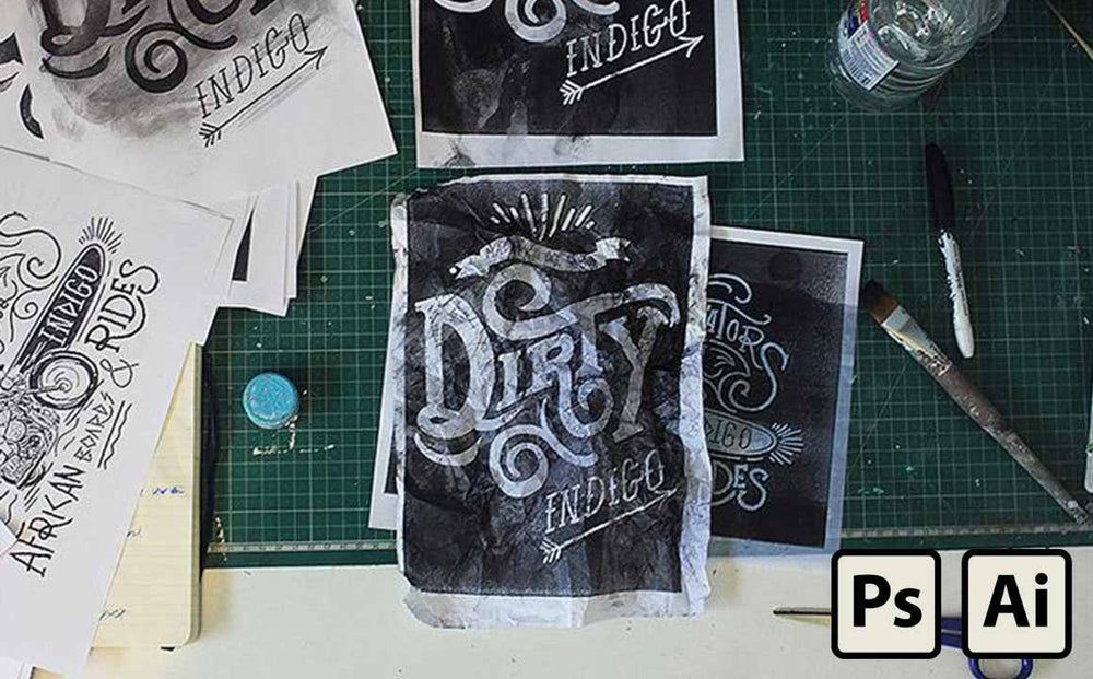
We get our hands dirty when we make RetroSupply products.

From going to a screen printing studio and torturing the equipment to breaking pens so they get unique strokes.

We work analog and make it digital for you.

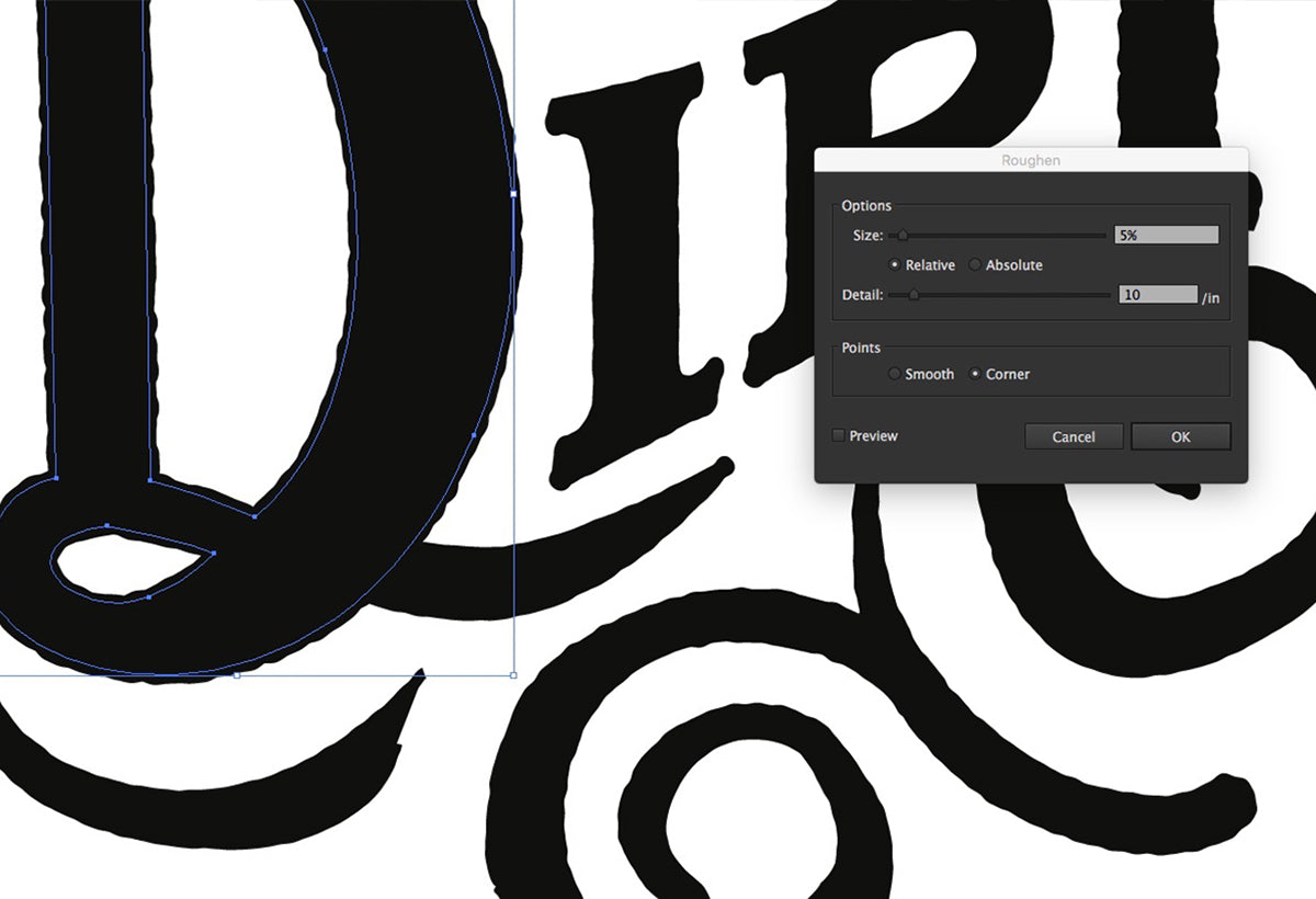
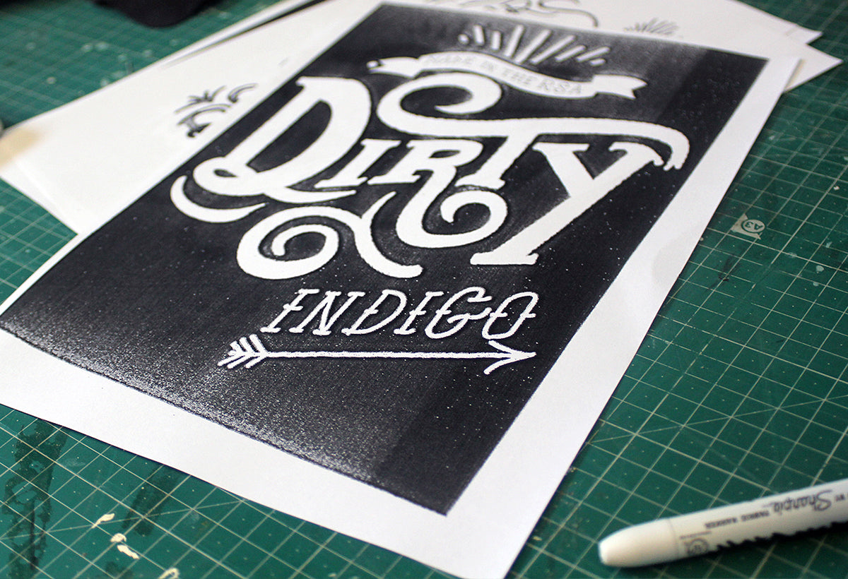
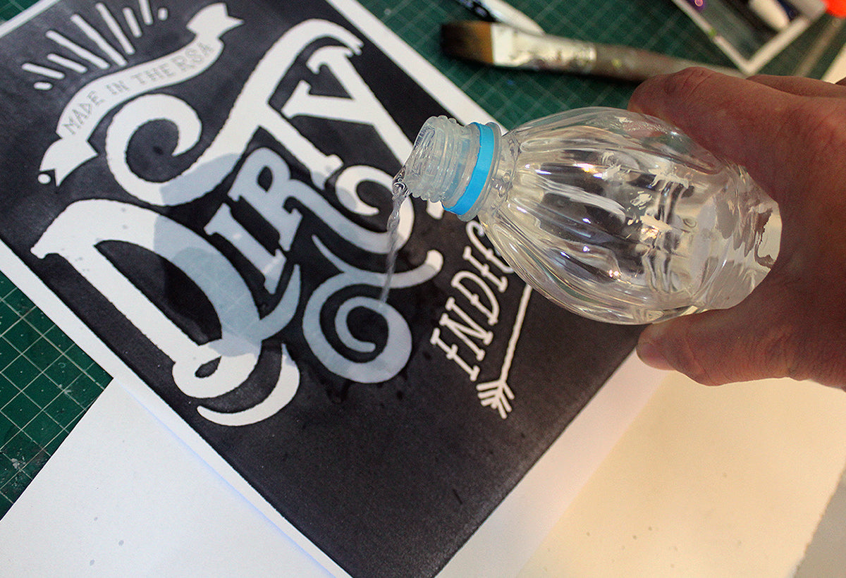
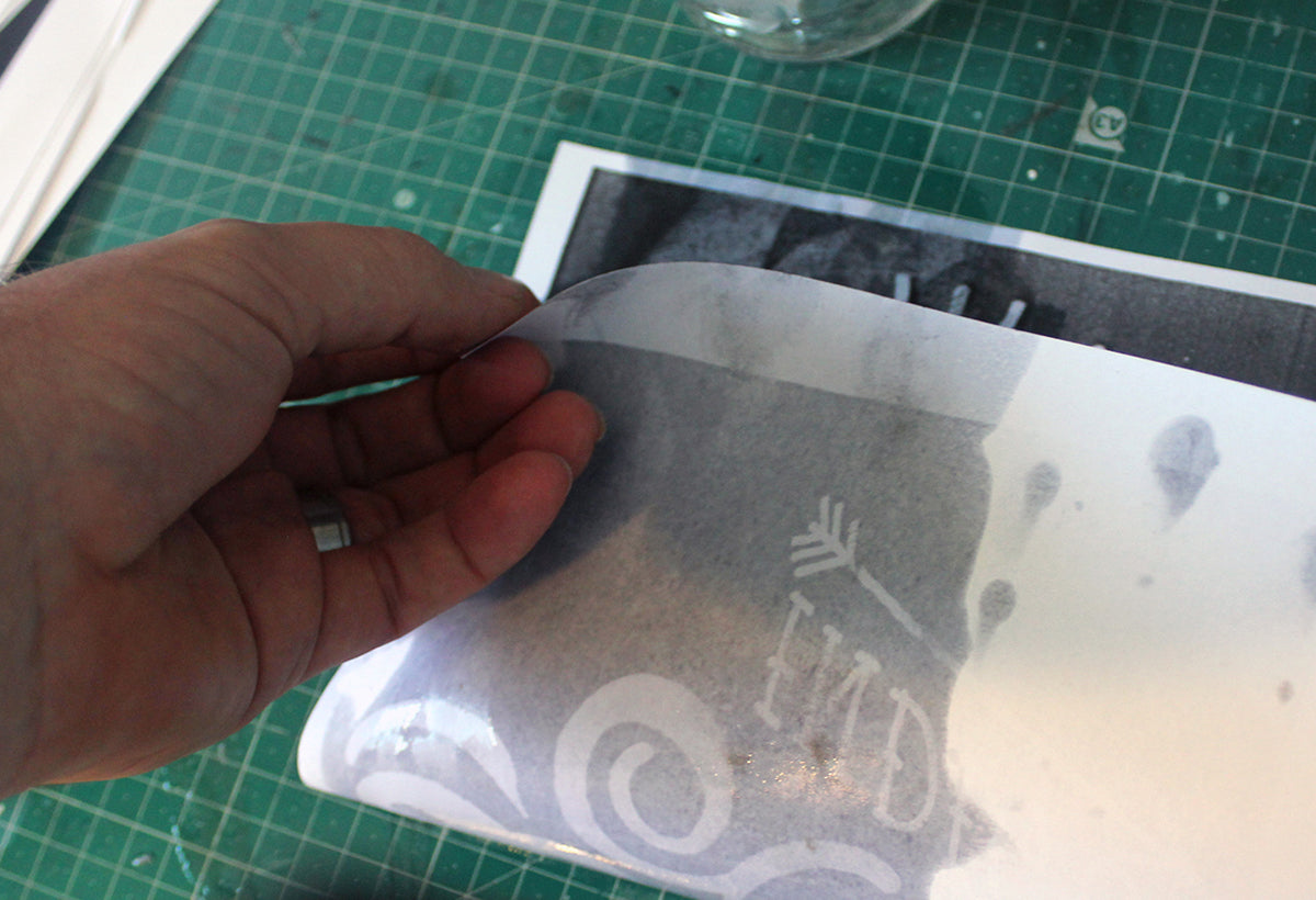
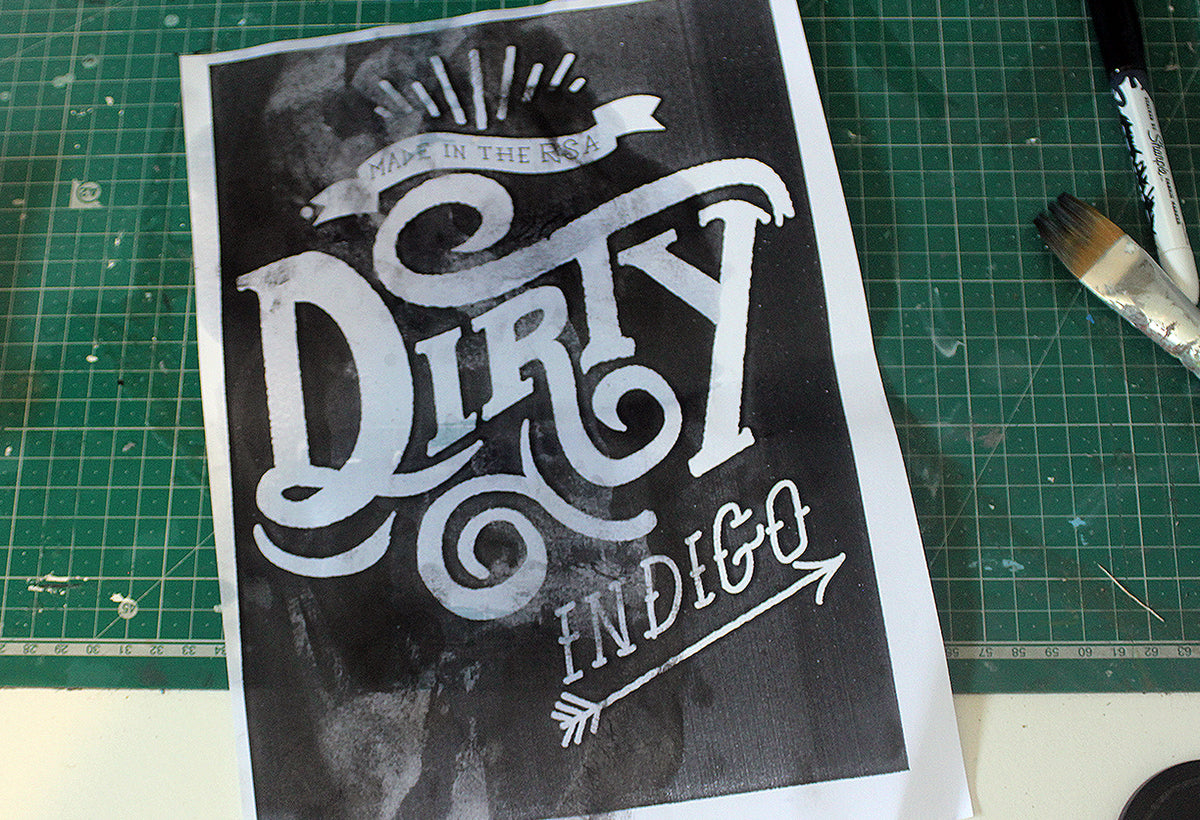
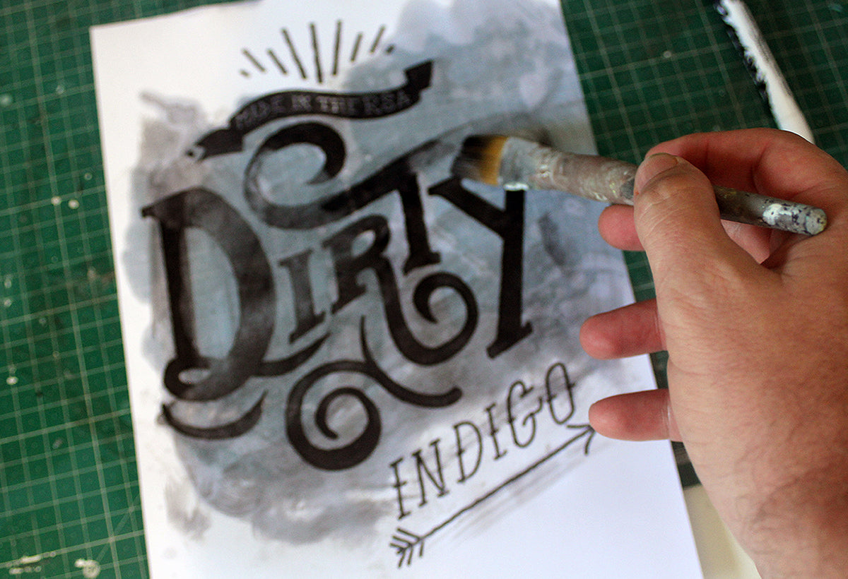
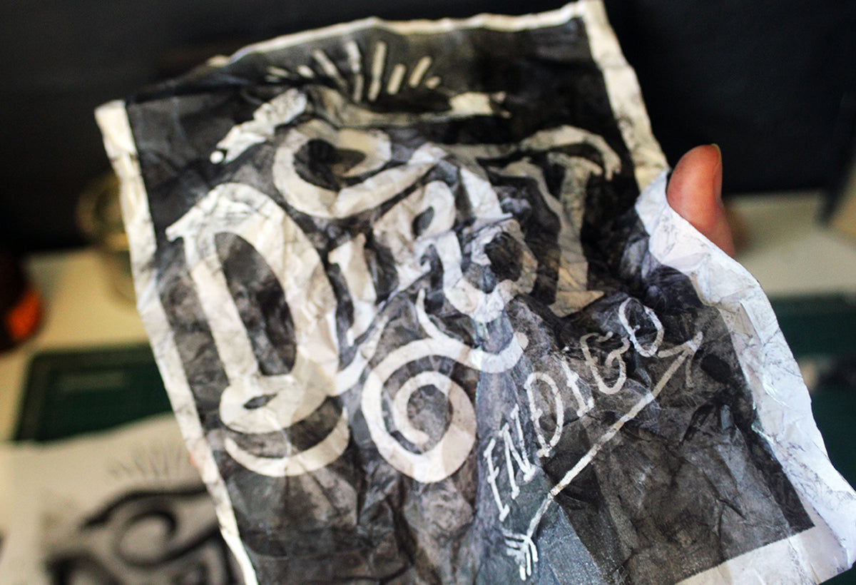
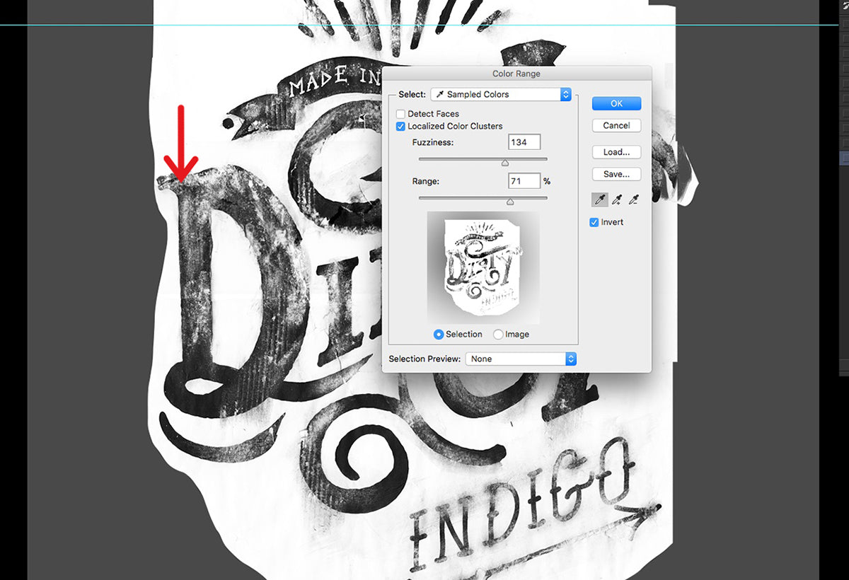
In this tutorial we're turning it upside down, our good friend Wesley Van Eeden shows you how to create some killer grungy, gritty designs with toner and paint thinner.

Want to add some gritty textures to your work without getting your hands dirty? Check out these 24 products designed to make adding grit easy.

Getting Started

For this tutorial, I would suggest working with Adobe Illustrator. This will give up sharp clean lines and allow us to use the handy roughen filter.

Create your type or design that you would like to add texture to in Illustrator and then use the “roughen” tool to help add to the textural qualities that we are going to create (make sure the images have been expanded and go to Menu > Object > Expand).

For a more organic look try roughening your typography before you print it out Select your work and go to Menu > Effect > Distort and Transform > Roughen.

Roughen your typography using Illustrator Roughen tab

You can choose the roughness that you would like by playing with Size and Detail in the Roughen tab.

Next, we will add a black background and make the text white and print out an A4 copy.

Okay, let's get gritty!

Step 1. Print your work out with a photocopier.

Go to the nearest printer or library that has a photocopy machine.

It's important to use a photocopier as the ink that is used for this process is called xerography, a dry process that prints your design out with powder that can be rubbed off - which is what we want when creating the textures!

The reason why we print it out with a black background is to have more of the xerography on the page so that we can experiment with creating different textures!


Step 2. Don't use the first copy.

Here's an important tip. When making a photocopy of your design, be sure to take the first photocopy print out and then make a copy of that print by replacing the original copy in the photocopy machine and printing a copy of the first print out.

This will help you gain more texture and distortion than the first print out.

Lettering with photocopy textures

Step 3. Keep making copies until it gets insanely gritty.

If you keep repeating the process above a couple times (around 10 copies starts looking nice and gritty) you will start to notice how your artwork becomes more and more textural as you can see in the image above.

Using lacquer to distress type

Step 4. Buy lacquer thinner from your local hardware store.

Return to the studio with your photocopies and get hold of some lacquer thinners from your local hardware store!

Be sure to have adult supervision if you are a minor working with this product.

Place a copy of your design that has been printed out onto a clean table. I suggest having a cutting mat or something to protect your table from the thinners.

And in the name of all that's good stay away from your computer (unless you like ruining expensive stuff)!

How to make a handmade grunge typography effect

Step 5. Pour the thinner onto your design.

Here is the fun part!

You can pour a little bit of the thinner onto your print out and fold the design in half.

Create grunge typography effect by folding paper

The thinners will spread and interact with each side of the page. You don’t have to have it folded for too long, probably a couple seconds.

How to make a handmade grunge typography effect

Step 6. Trying folding it.

Fold out the paper and you should notice that your photostat has started to rub off and interesting textures have been created!

Experiment with a brush on your distressed type

Step 7. Experiment with other copies (optional but fun).

You can try experimenting with the other copies that you have made.

You could pour some thinners on a printout and use a brush to paint over your artwork using the thinners as paint!

You’ll notice that this will pull the photocopier print off the page. The trick is to experiment to get your desired effect.

You could even pour some on a page and scrunch it up into a ball and then roll it out! You get some interesting results!

The idea here is to really experiment and have fun. You can use water to also rub onto the photostat but this will be less hardy than the thinners.

Use other photocopies and paint with the toner

Step 8. Scan your work.

Scan in your artwork at 300 dpi so that it is of decent quality. You will want to remove the white background so that we can place any color underneath it.

Adjust levels to enhance grunge textures

Step 9. Adjust your curves.

In Photoshop go to Menu > Image Adjustments > Curves to adjust your settings.

We're looking to increase the contrast a bit and really make those textures jump off the screen.

Use Photoshop Color Range to remove white background

Step 10. Remove the background.

In this example, the red arrow indicates where I will be selecting which will be done once you go to Menu > Select > Color Range.

Click on the color you want to sample with the Eyedropper Tool. You can play with the fuzziness to get more of an accurate selection.

Also, if you need to add or take away from your selection, you can use the eyedroppers plus and minus symbol to do so.

You may need to do this step a couple times in order to remove all the white.

Grunge typography t-shirt tutorial

Step 11. Place your final design on something.

Place your design onto any background an adjust the colors of your design by using whichever method you are comfortable with.

You can also use Brightness/Contrast to adjust the levels in the artwork to make it pop a little more. Go to Image > Adjustments > Hue/Saturation to change color.

A photo of Wesley van Eden in front of a mural surrounded by palm trees.

ABOUT THE ARTIST

Resoborg is Wesley van Eeden who is an artist, illustrator, graphic designer and muralist who works for clients across the world.


From designs on skateboards to corporate illustrations for banks in South Africa. Resoborg offers a professional service in crafting, typography, graphic design, illustration, logos, corporate identity, packaging, art direction and murals.

See more of Resoborg's work here.

Recommended Articles

HOW TO DRAW AN AUTHENTIC COMIC PANEL

Learn how to create a vintage-looking comic panel with our step-by-step tutorial. You'll be able to add color halftones, wear and tear, and other effects to achieve a convincing vintage aesthetic.

View the tutorial.

Risograph Print Pack for Photoshop

Transform your digital artwork into analog Risograph prints in seconds with the Risograph Print Pack action for Photoshop. Our step-by-step guide walks you through this easy process of making authentic looking Riso prints for display or mocking up your digital designs for print.

View the tutorial.

How to Create Print Distress

Weatherization, age, and handling can affect the look of traditional prints. This causes a natural distressing that is missing in digital artwork. In this easy, step-by-step set of instructions we'll show you how to achieve this touch of authenticity to your work.

View the tutorial.