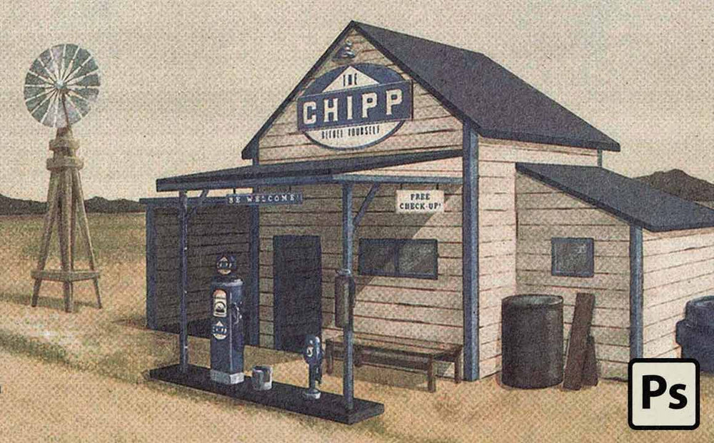
This picture looks hard as hell to draw.
It's drawn by Igor Oliveira. He's a university student in Brazil.
It took practice, experimentation, and time to learn to create stuff like this.
But it wasn't natural talent. Just patience and putting in the work.
I hope you'll read this entire tutorial. From start to finish. Then try to make something like this on your own.
Experiment. Love your mistakes. Push yourself.
Okay, enough motivational talk. Let's do this. Here's Igor...
Welcome
In this tutorial, I'm going to show you step-by-step how to create a classic mid-century illustrated postcard.
We're going to spend a lot of time talking about perspective and the magic of vanishing points.
Why?
Because even a beginner's knowledge will bring depth and life to your work.
If the idea of learning about perspective is vanishing points is making you want to leave the page don't!
Designers and illustrators that understand perspective enjoy a huge advantage over their peers. So let's make you part of the club!
Here's what we're going to be talking about:
- Developing geometric constructions in perspective - explaining vanishing points and horizon lines (sounds fancy but it's not complicated and will increase your rating on the bad ass meter).
- Creating a simple visual identity by working with a color palette and creating a logo/layout for the postcard using the Curiosities Font Collection.
- Correctly using the brushes and actions from Mid-Century Mega Bundle to give a retro finish to the illustration. This pack isn't for everyone. You need to be willing to experiment and watch all the videos (which show you exactly how each effect works so you can create it manually).
This Tutorial is Advanced (But Try It Now Matter What Your Skill Level)
This is an advanced tutorial. And I consider that you are already familiar with Photoshop's basic tools and shortcuts.
I'll give you some specific instructions, but you shall already know shortcuts like Brush (B), Eraser (E), Selection Tools (M/L) and Zoom (Z).
If you don't know these shortcuts you should memorize them. You'll work faster and blow your friends away, haha.
Enjoy the Process and Don't Be Too Hard on Yourself
Remember, This kind of illustration is about creativity and patience. If you're starting to draw, use simple cubes/cuboids shapes and I'm sure you'll have excellent results.
With more practice, you can start adding more details and playing around with a few different forms. Have patience when drawing and have patience with yourself.
Step 1. Research the building you want to create.
First, think about what kind of building you want to do.
It could be a retro gas station, a simple house, a skyscraper, or even a castle.
Whatever it is, search for many references as possible. Consider the proportion of height, width, and depth, display of doors and windows, number of floors. Then start to sketch on paper.

Of course, nothing here is decisive, but it's important to have a model to guide you on the perspective construction.
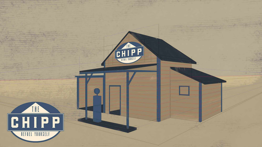
Step 2. Map of the perspective of your drawing.
Look at this image carefully:


- The gray part is the final illustration area.
- The pink line corresponds to the horizon line. Think of it as a division between sky and earth for now.
- The A and B points are the vanishing points.
- Rectangles 1, 2 and 3 correspond to the building’s front area sketched on paper.
- Blue lines are extensions traced from the vanishing points.
Compare this image with the final illustration and the sketch. Make sure you have understood each element before proceeding.
Step 3. Create your document.
Create a document in a proportion according to the purpose of your illustration (remember that it must be in high resolution). This corresponds to the gray rectangle in the figure.
Make a new layer and apply a random color. Now stretch the sides with the Crop Tool (C).
In another layer, trace a horizontal line that corresponds to the pink line.
As stated before, imagine this line as the border between sky and earth. I suggest positioning it close to the center.
Pro Tip: Separate your layers. Use different layers for lines, vanishing points, extensions, and anything else that you can think of. It will save you a lot of time from trying to select and control individual objects.
Step 4. Add your vanishing points.
Place a point at each end of the horizon line outside the gray area (points A and B). The further away the points are from the main construction, the less distortion is caused by the perspective.
Draw a simple cube. Then, draw a vertical line to define the height.
Now, the front part of the buildings will be determined by extensions of point A and the side by extensions of point B. The front of the gas station is entirely drawn by lines from point A and the depth is given by the lines from point B.
If you're confused by this, It'll help a lot to experiment in your sketchbook. Practice makes perfect. Just keep sketching out the concept of using vanishing points until it makes sense.
When you are satisfied with your construction, start adding more lines to set the doors, windows, and roofs.

Whether you are constructed a complex gas station or a simple cube, the method is still the same.

To avoid confusion, trace lines in different colors. And different layers!
Step 5. Choose your colors.

Here is where I start using a color palette.
Note that in Chipp's Postcard the composition is given by shades of beige and blue. That’s not by accident. The beige color is predominant to conveys an idea of dryness, sandiness, age and almost lifelessness. Here, the sky and vegetation are set as beige.
Blue is a fresh color and conveys feelings of serenity, tenderness, and authority. To creating a good contrast between beige and blue, it helps express a similar feel.
All of the other colors present in the illustration are variations of brightness and saturation of these two colors.
If you're just a beginner, I recommend you work with two colors. Two colors are plenty and make it easier to build a harmonious piece.
Step 6. Make a simple logo.

I used the Wheat and Barley fonts from the Curiosities Font Collection for the logo because the typeface pairs beautifully, have a retro aesthetic and are strong enough for a gas company.
For the name is simple and memorable. It has no deep meaning; I just wanted something that would fit the visual proposal.
Step 7. Add your colors.
Casually, test the colors and try to give a contrast between the elements to highlight the most essential parts.
Once this is done, start coloring your entire piece.
Here are some helpful tips:
- Use only select brushes. This gives consistency to the illustration, especially if the brushes are similar. You can use one for the details and another for large areas, for example.
- If you're creating a retro illustration use brushes with noise. You’ll find several of these in the Mid-century Mega Bundle.
- Use a smaller opacity in the brush and slight variation of each color. It might take some experimentation, but the result will look killer!
- In the name of all that's good, don't use the Paint Bucket Tool (G).
Step 8. Add the final touches.
If you illustrate regularly, you know that oftentimes your illustrations don't really come together until the last 20% of the work.
This illustration is no different. I added some final touches to the photo below which made all the difference.
Adding little details to bring life to your work.

I can’t help you too much with this. But, it's important to know that objects and details follow the same principle of perspective with vanishing points. Wisely draw, erase and reposition.

Note: You’ll probably have several layers at this point.To organize the layers, create layer groups to separate each category: baselines, colors, objects, etc. Organize!

Now a big step... light and shadow.
The realism quality of the illustration depends on your ability to use light and shadow properly.
Illustrating is a journey. This comes with experimentations of light and shadow. Reading books and articles can help you along the way.
Don't be afraid to make mistakes. Mistakes are the price of getting better.

It is best if you leave one side lighter than the other side and the roof even brighter than the two sides. Doing this should give quality to your illustration. To do this, add multiple layers of Brightness /Contrast effect and apply Layer Masks.
Step 9. Finishing with a Retro Touch
If you plan to turn your illustration into a retro ad or postcard, search for some layout references. When you are done, use the same identity for the postcard and, perhaps, create slogans or short narratives too.

To finish the illustration with a grand finale, Photobaker is used. Photobaker is included in the Mid-century Mega Bundle.
Like I said, in the beginning, The Mid-Century Print Pack gives you the best results if you invest some time in it. Be open to experimenting and watching the videos.
In addition, the two colors you select in Photoshop make all the difference.
In this postcard, I used a very light blue as the first color and a darker beige as the second. The other variations gave interesting results as well.

Finally, I did a test print of this postcard and then scan it. I found the result looked pretty sweet.

Conclusion
When I first told you to be patient with yourself, it was for real. That is because talent is out of your control. Practice and consistency are far more important.
When I compared my drawings from 6 months ago to this one, I can see I have improved a lot. But I also know there is a lot to learn before I can paint angelical pin-ups like Gil Elvgren. How far I will go is a matter of perseverance and patience. We all got long roads ahead.
Bio
Igor Oliveira is a true lover of retro design and art. He is a third-year design student at the Federal University of Minas Gerais, Brazil.
Recently started the Happy Trails page as a way to bring back this wonderful aesthetic from the past and give a new meaning.