We’re constantly inspired by the way in which our products are used. From self-published comics to posters, branding and boundary-pushing new illustration styles, we’re blown away by the amazing work being done with RetroSupply goods every day.
So we thought we’d shine a spotlight on four brilliant projects, going behind the scenes on each to find out which RetroSupply products were used – and how. As the work here shows, there are countless different ways of getting more from our retro brushes, textures and actions. The secret is to jump in, and get to know your tools through experimentation.
This article is only the beginning: over the coming weeks we’ll be sharing a number of inspiring case studies from across the RetroSupply community, delving deep into the creative process of each project, and sharing pro tips and techniques for crafting the effects seen in each one.
In the meantime, be inspired as we explore four fantastic projects created by illustrators and designers working across the creative sphere…
Project 01: Quickly achieving a heavy-line style of portraiture
- Artist: BJ Heinley
- Project: Portraits
- Client: Self-initiated
- RetroSupply product: SpaceRanger brush kit and tutorial pack, $29
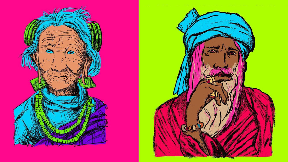
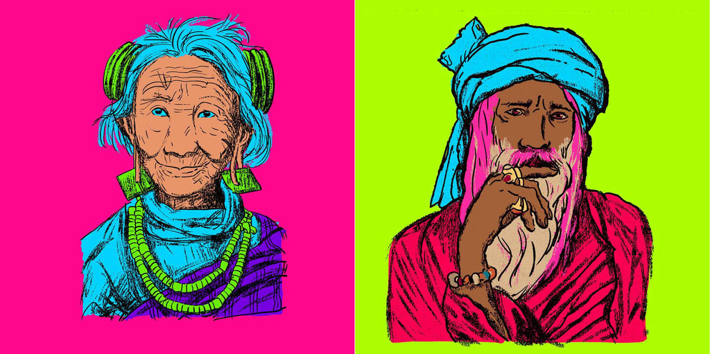
Texas-based designer, artist and entrepreneur BJ Heinley created his Portrait series using RetroSupply’s SpaceRanger brush set. A personal project, the series saw BJ experimenting with a heavy line style of portraiture, set against a psychedelic 70s-inspired color palette that reminded him of his childhood.
“Twenty-five years ago in art school I used to use oil/wax sticks and conté crayons,” he recalls, “so I was trying to get a similar effect with the RetroSupply brushes. “I was never any good at color back then, so I thought I’d play around a bit here.”
BJ used the SpaceRanger brushes to draw into a transparent Photoshop layer, adding the basic shapes and outlines of the subjects. “I was going for a loose impression, so I was really free when it came to filling in with the larger brushes on a second transparent layer,” he explains.
Tip 01: Get reductive with the Eraser tool
“I set the SpaceRanger brushes into the Eraser tool, so I could use the same technique but in reverse,” says BJ.
“The color came last on a third layer, and I opted for flat / opaque to really set off the heavily scummed lines. The most challenging part of the project was achieving a likeness to each person while using a super-chunky line, but I think I was successful.”

Tip 02: Work faster by using quality brushes
“During this project I learned that I can do this style of portrait relatively quickly, making turnaround times faster,” adds BJ. “This assists meeting client deadlines, translating to more money in my pocket. I love to draw, so high-quality brushes like these allow me to do more of what I love.”
Project two: Creating Russian folklore-inspired lettering with the Hand-Lettering toolkit
![]()
- Artist: Shauna Lynn Panczyszyn
- Project: The Bear and the Bees
- Client: Lion's Nest Gallery at ICON
- RetroSupply product: The Hand Lettering Toolkit, $39
Hand-lettering artist and illustrator Shauna Lynn Panczyszyn created The Bear and the Bees for the Lion’s Nest Gallery show at ICON Conference, in Austin, Texas.
“The show theme was ‘Tall Tales’, so I pulled from Russian folk stories for my work,” says Shauna, who used brushes from the Hand Lettering Toolkit, which she collaborated with RetroSupply to create. It contains 67 brushes, six time-lapse videos and a bunch of bonus additions to help users create professional hand-lettering work.
For The Bear and the Bees, Shauna laid out the rough design using the Hand Lettering Toolkit’s blue and red pencil sketchers. “I used the solid letter filler for creating the larger shapes, and the sexy letter liner for the details,” she adds. “I also used the Letter Builder Textured Small 1 brush for the shading on the leaves.”
![]()
Tip 01: Use a pressure sensitive tablet
“The best way to use these brushes is with a pressure sensitive tablet – I love the Wacom Cintiq and the Microsoft Surface Pro 4 for achieving this,” says Shauna. “The harder you press, the more ‘ink’ is put down onto your piece; and the lighter the pressure, the more delicate a line you get.”
Tip 02: Keep going
“The most challenging part of this project was making sure I kept contrast throughout, without losing the simplicity of the color,” she admits. “I kept playing around with it until I was happy with the outcome.”
Project 3: Adding a halftone effect with RetroSupply’s SparkPrint action
- Artist: Josué Menjivar
- Project: One Chance
- Client: Self-initiated
- RetroSupply Product: SparkPrint action, $15
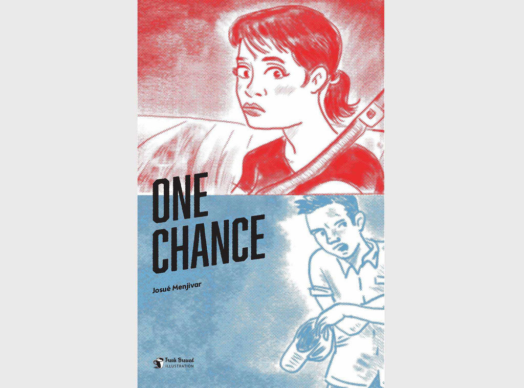
Canada-based illustrator, independent comic book artist and author Josué Menjivar runs graphic design and illustration business Fresh Brewed Illustration, and teaches at Langara College in Vancouver.
He’s been self-publishing comics since 1995 and regularly uses RetroSupply products in his projects. One of his favorites is the cover of One Chance, a 12-page short story about running away. Josué used RetroSupply’s SparkPrint action to quickly boost its visual appeal with a classic monotone halftone effect.
“The interior was black and white, but I needed to find a way to make the cover stand out,” he explains. “I designed it using the SparkPrint action, which gives a cool halftone effect.”
“I underwent the process twice – the top was created using the SparkPrint’s red color and the bottom with its blue color – and then merged the images. This Photoshop action saved me time and the cover ended up looking so much better.”
Josué’s best advice for working with RetroSupply products is simply to dive in and start experimenting – don’t be intimidated by your project or the amount of choice available to you. But he has some pro tips too...
Tip 01: Mix and match RetroSupply products for instant inspiration
“One thing I love to do with RetroSupply products is experiment with actions for interesting results. For example, I like using RetroSupply’s Photo-Toaster action (part of the RetroSupply Photo-Baker Kit, $15) to create a 1950s-style illustrated effect in Photoshop, and then using SparkPrint over the result.
“I then process the result with the RetroLab premium photo effect kit ($29), which gives you vintage film styles. So mix and match. You will get ideas for future projects.”
Tip 02: Convert your final files before exporting
“When using the RetroSupply Vector brushes, make sure you export your final image as a TIFF, PDF, PNG, or JPEG,” he advises, “as the original Adobe Illustrator file will be quite large.”
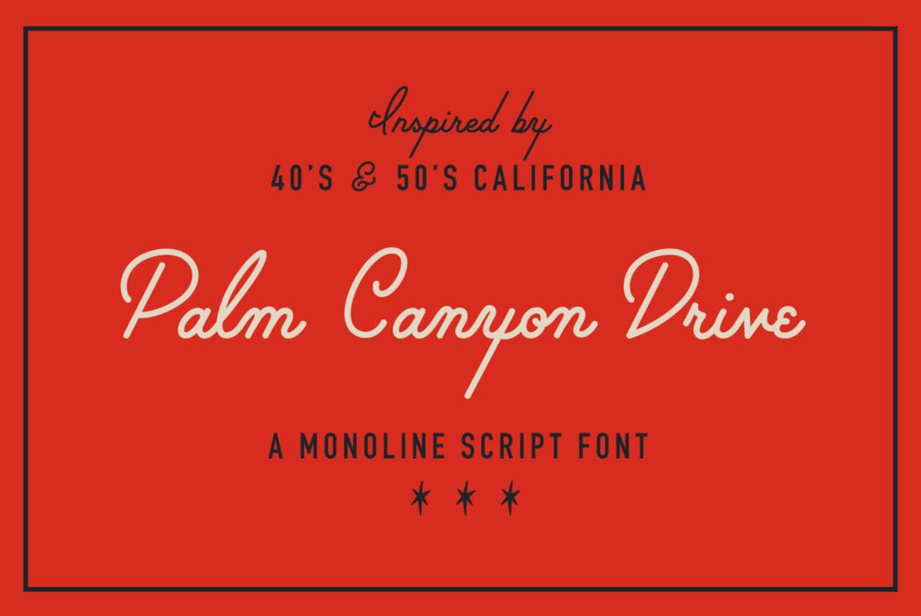
Project 4: Creating a retro-feel with the Palm Canyon Drive font
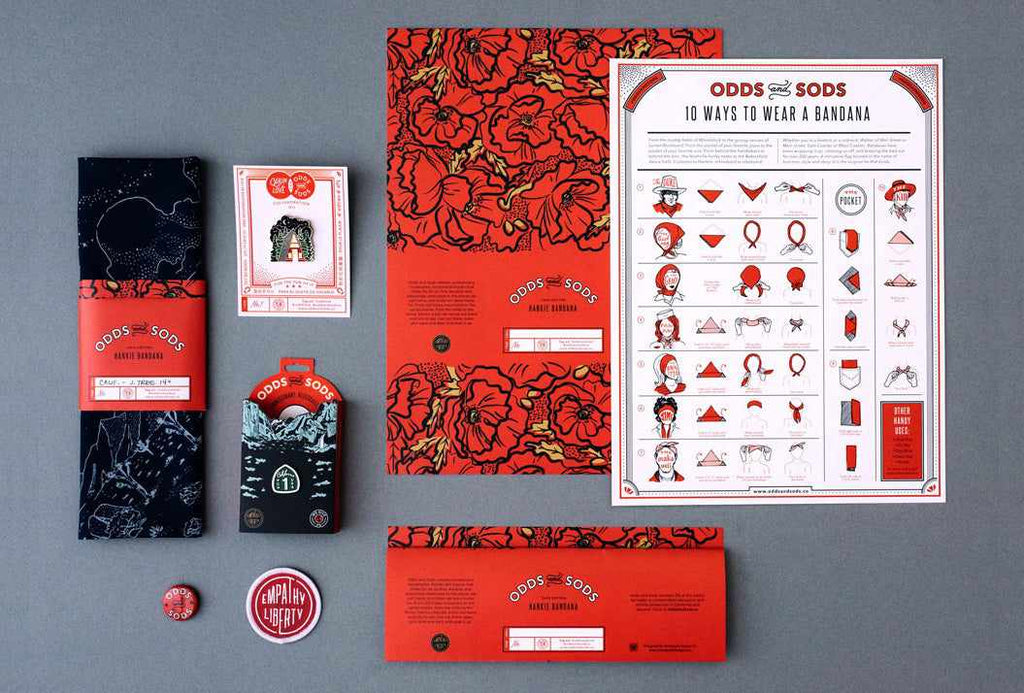
- Designers: Amy and Jennifer Hood
- Project: Odds and Sods branding
- Client: Own client
- Product: Palm Canyon Drive font, $19
Designers Amy and Jennifer Hood launched Odds and Sods, an enamel pin and bandana company, as a creative outlet free from client constraints. The sisters are also co-founders of boutique design and branding firm Hoodzpah Design, and wanted a side-business that would give them complete creative control of their work.
“Not only that, but we wanted to start building a more passive income stream for ourselves so we don’t have to work so much,” adds Amy. “Work less, live more.”
RetroSupply font Palm Canyon Drive features throughout the Odds and Sod branding and on various pin designs. Amy designed the monoline script with RetroSupply in 2015, and the retro aesthetic turned out to be perfect for their new brand.
“We used Palm Canyon Drive because it has this great retro feel to it,” she explains. “You can imagine seeing it anywhere in Palm Springs, California. Our brand has a heavy focus on spotlighting geographic locations we love – much like the pins you used to pick up at the Grand Canyon or Niagra Falls as a kid – so using this retro-style script was perfect for our brand feel.”
Tip 01: Use Palm Canyon Drive sparingly
“We use the font sparingly as it’s a display font and can easily take over a design,” explains Amy. “Palm Canyon Drive shines best when used in small quantities with other simpler fonts to offset it.”
Tip 02: Memorable brands are consistent
The most challenging part of designing and running Odds and Sods has been to gather attention for the brand. Amy and Jennifer do this by making new and engaging content that shows how to wear and style their products, and by keeping a consistent brand look throughout their packaging and web presence.
“We use consistent fonts and a very distinct color palette so people will begin to recognize Odds and Sods if they stumble upon it in Iron and Resin in San Fransico, or on Pinterest one night,” says Amy. “This means constantly utilizing our brand fonts – Palm Canyon Drive, Steelfish, and Avenir Next – and our classic Odds and Sods poppy red.”