How to Draw an Old School Race Car in Photoshop

How to Draw an Old School Race Car in Photoshop

In this tutorial, we'll cover everything you need to know to draw a retro race car in Adobe Photoshop.

You're going to learn how to create a basic sketch from a reference photo, inking your work, coloring your illustration, and adding paper textures and gritty distressed textures to the final artwork the easy way with textures and blending modes.

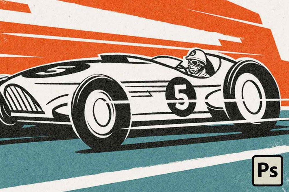
1. Take It On! Getting Inspired

While pouring over scads of reference images of old roadsters and racecars for this assignment, I noticed something weird happening.

The song “Take On Me” by the eighties band Aha was playing on repeat in my head. And not just a little, I mean a lot, like, over and over and over and over. It was ridiculous.

Now, I have no problem with the song, it’s an awesome song, but after a while it was kind of driving me nuts.

I guess that in my search for photographic reference I’d triggered my brain to do a little image inventory of its own. Once I finally realized this song was repeating in my head I started to see all these cool images flashing through my mind’s eye – kind of like a video: Two villains in helmets, in racing uniforms and carrying pipe wrenches - coming after the lead singer of Aha.

“Oh yeah! That awesome hand-drawn animated video of theirs! The dudes in that were racing roadsters! Man, I gotta go check that out!”

Was the video totally inspiring? Yes!

Was I remembering it right? No! No, actually I wasn’t.

It turns out I misremembered the story. The guys in it were actually racing motorcycles with sidecars attached, not roadsters. But no big deal, because it got me checking out all those super cool hand drawn images of racing machines, spinning wheels and the two dudes in their racing gear (at least I got that right).

Inspiration is critical to making great art. Really try to get yourself into the art you’re going to make. Immerse yourself in visual (and maybe even audio) references. Immerse yourself in the subject you’re working on. Find things that get your blood moving and your head to thinking about the subject in ways that put you into the zone.

2. Break It Down - Reference Material

For this piece, I zeroed in on a reference image that seemed like it had just the right feel, the most interesting overall shape, and the most dynamic angle.

Vintage roadster reference image for use in Photoshop design

I knew I was going for an exaggerated version of a racecar, so to have the greatest flexibility in this process, I broke down the reference image of the car by clipping out the pieces placing them on separate layers.

Roadster with wheels isolated in Photoshop

3. Making it mine – Sketches & Adjustments

With everything on layers, I could then start sketching and adjusting. I wanted a more dynamic looking racecar so I used my SCALING, SKEW, and DISTORT tools to skew the wheels forward and gave myself as much license as I needed to sketch a re-imagine the chassis using my digital brush.

Roadster with isolated skewed wheels and sketch overlay in Photoshop

4. Meat on the Bones – Adding Depth

Now that I had an idea of what I was after, I fleshed out the line work with some shading – this would help me once I jumped to taking the whole piece down to a high-contrast black and white image.

Shaded sketch of roadster with isolated wheels in Photoshop

INK LIKE A PRO.

A retro concept artists' best friend! Get energetic and expressive lines, lines with subtle gritty texture, and pens that emulate the look of real inkers.

5. On the Road – Background

The next move was to place the car in a scene. After a big of playing around, I decided to go for a simple desert scene – which was nice and graphic and easy to break down into two colors.

Roadster sketch with roughed in background in Photoshop

6. Wrong Way – A Revision

The longer I worked with the image I had created, the more dissatisfied I was with the length of the car. I really liked those compact roadsters better so I just cut a chunk out of the middle of my car and pulled the two remaining pieces together. Bingo! Now, that was something I felt good drawing over!

Roadster drawing with shortened body length

7. Petal to the Metal – Making the Line Work

Using my sketch as a guide, I started creating the final line work. I did this in stages and kept every line I made on a separate layer above the sketch so I could revise as needed along the way. Just because it looks simple, doesn’t mean it didn’t take a lot of time to get there. Once all the line work looked good, I merged all the layers.

The wheels I made using basic shapes. Ovals are near impossible for me to hand render so this was the easiest way to go.

Roadster drawing with diagram showing how to draw wheels using shapes and scale, skew, and transform tools in Photoshop

8. Drivers Needed

After finding just the right photo reference, I placed a cut out of a driver into the line work and used it draw over. Again, each line I made on a separate layer so I could make revisions without too much trouble.

Isolated reference photo of a driver placed on top of roadster drawing to show how it was drawn in Photoshop

9. Dropping in Decals

This is a pretty simple process but it did take a few tries to get them placed just the way I wanted them. Again, I used my SCALING, SKEW and DISTORT tools to achieve the angles I wanted.

Placing decals into drawing using the scale, distort, and skew tools in Photoshop

GET THE PERFECT FONT.

Dragster is a collection of 8 display fonts inspired by vintage fonts used for race logos, car numbers, racing numbers, helmets, and signage.

10. Final Touches

I was happy with how the car had turned out but knew that I needed to really emphasize the illusion of speed. To do that I placed white speed lines over top of the artwork in some key places. First, I drew the white lines horizontally on a layer and then placed them using the SKEW, ROTATE and DISTORT tools.

Drawing of roadster with speed lines created with the rotate and skew tools in Photoshop

11. Let's Add Some Archival Goodness

Because we're going for a mid-20th century America illustration style like we might find in an old magazine like Car Craft, let's add some gritty distressed textures and analog print effects.

I'll be using textures from the Authentic Screen Printing Toolkit for all the textures in this piece.

First, I'm going to add Chipboard 02 Heavy as a base. I'll add it by selecting File > Place Embedded... and then resizing it to cover the entire canvas.

Adding texture to retro race car illustration in Photoshop

GET THE TEXTURES.

The Authentic Screen Printer's Toolkit is full of full page textures and edge textures that will give your illustrations that authentic look you crave.

After resizing the texture, I set the Blending Mode to Screen and adjusted the Opacity to 20%. This makes the texture very light and subtle like real paper. Of course, you can adjust this to whatever intensity suits the work you're doing.

Retro Race Car with vintage textures, blending mode, and opacity settings in Photoshop

Finally, I'm going to add a few extra textures from the Authentic Screen Printing Toolkit to add additional scuffing. I added these in the same manner — by selecting File > Place Embedded... and then setting the Blending Mode to Screen.

Adding scuffed textures to retro illustration in Photoshop

The Final Illustration

Here's the final illustration. I added a little bit of roughening to the edges to create an ink roughening effect by selecting Filter > Distort > Ripple and then tweaking the settings (these setting will vary based on canvas site and personal preference).

Retro Race Car Tutorial for Adobe Photoshop

ABOUT THE ARTIST

Matt Wood has been a professional artist and illustrator based in Colorado for 30 years. He is 100% self-taught. Prior to going solo in 1998, Matt was a Graphic Designer and Art Director. In 2012, he also founded a collaborative animation studio named Bad Idea Motion Studios with colleague and longtime friend Greg Vannoy.

With work appearing in scores of magazines, on product packaging and in print ad campaigns - Matt always keeps a number of other artistic pursuits in the works. So far, his two greatest superpowers are creating art in multiple illustration styles as well as cultivating enduring relationships with his clients. This is his very first detour into tutorial writing (and he’s really digging it!)

You can check out his work on Instagram @mattwoodillustration and at badideastudios.com.

Other Tutorials We Think You'll Enjoy

Love this tutorial? Here are some other tutorials by designer and illustrator Matt Wood.